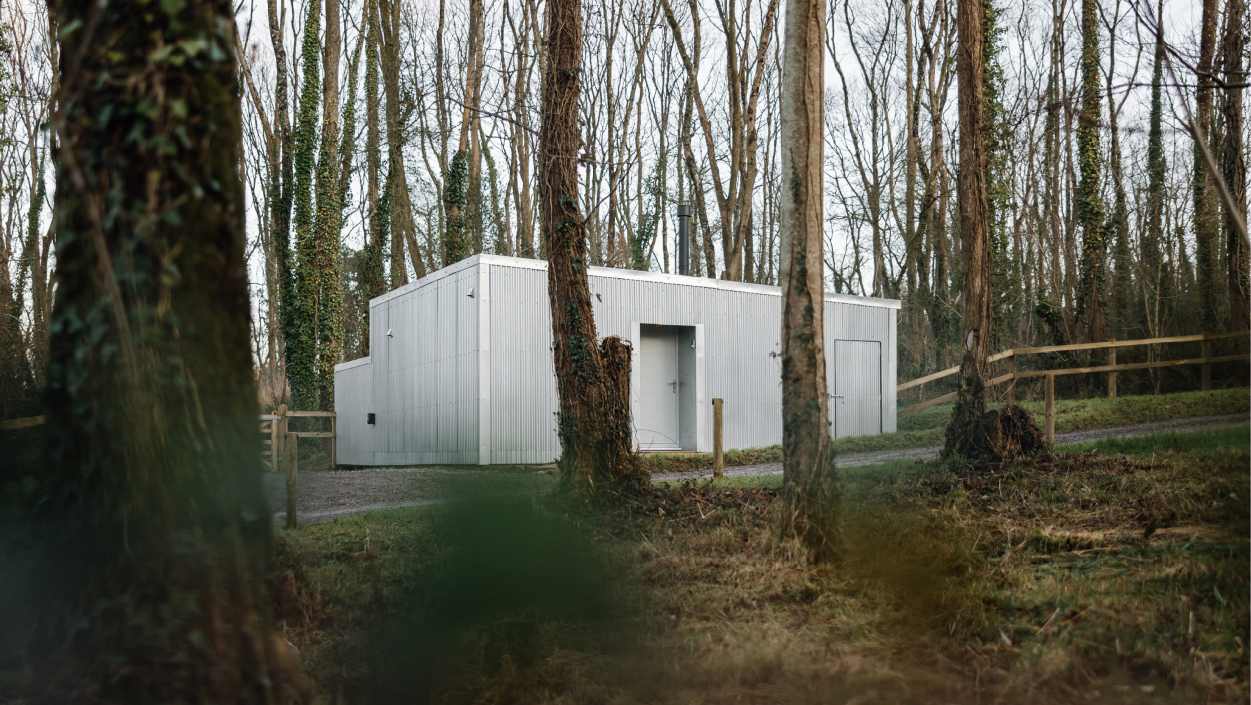
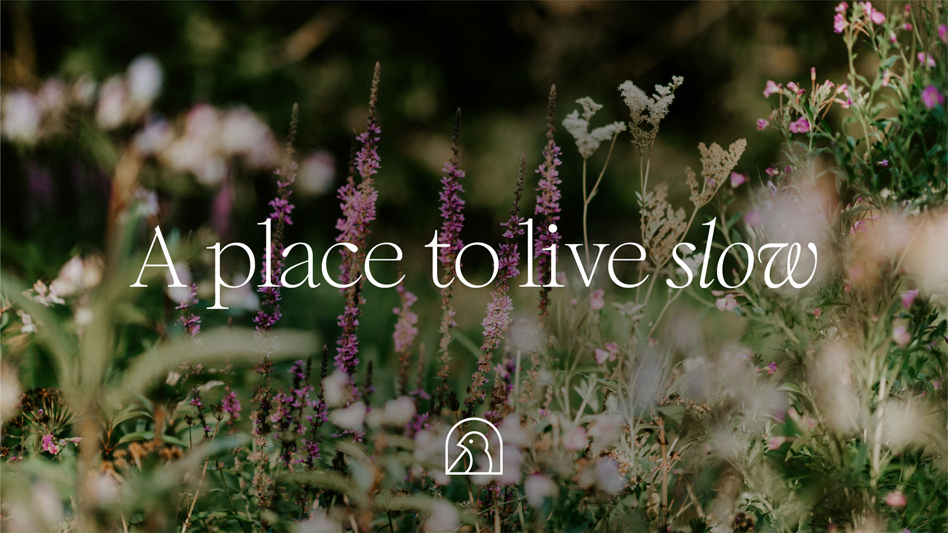
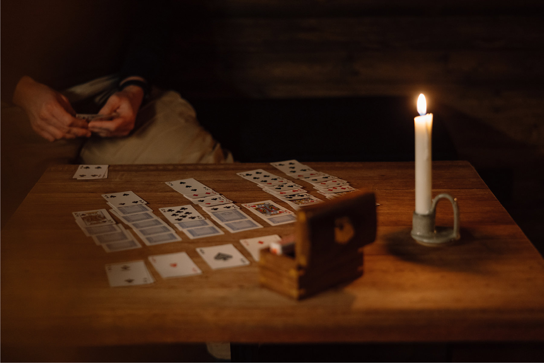
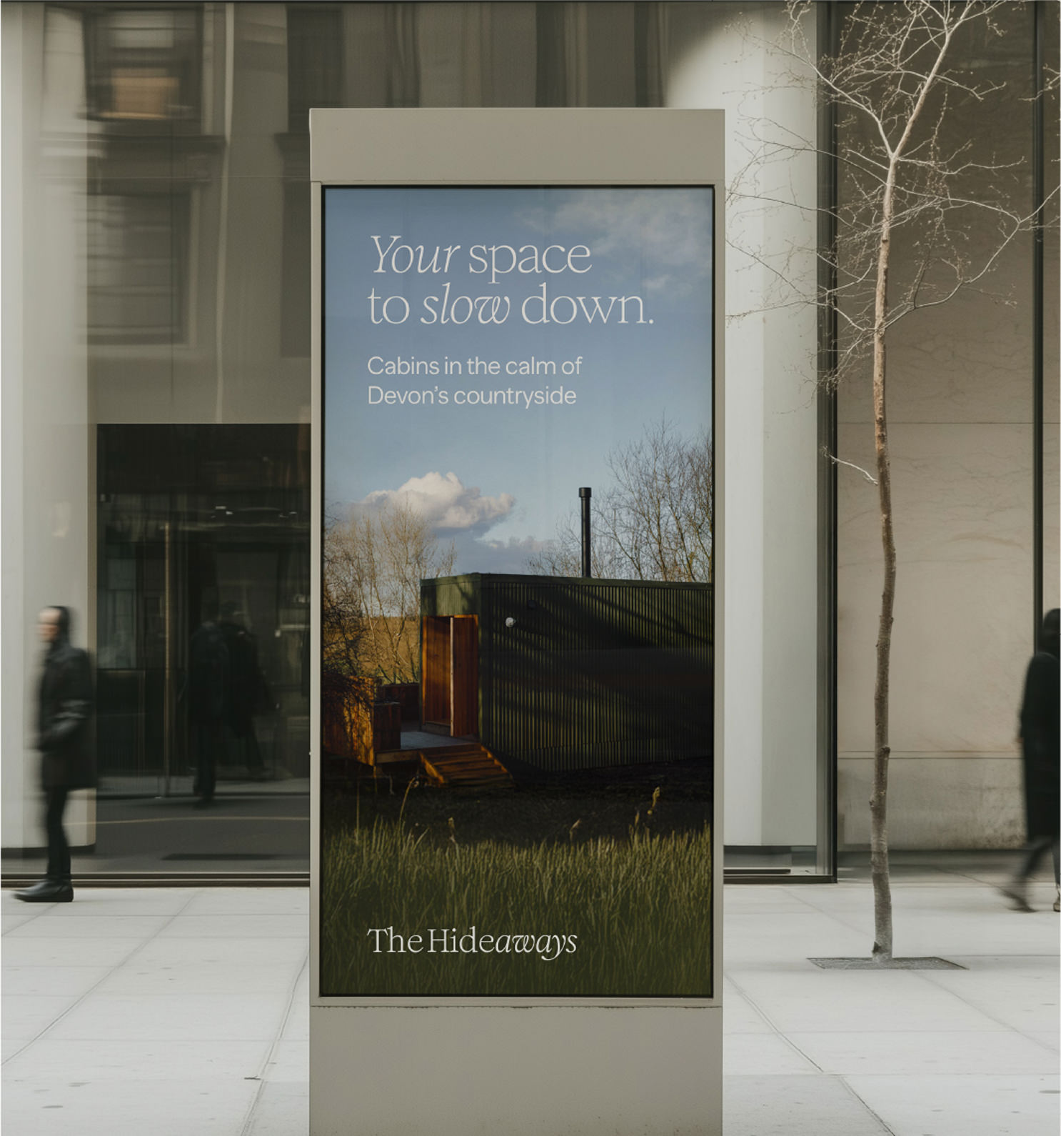
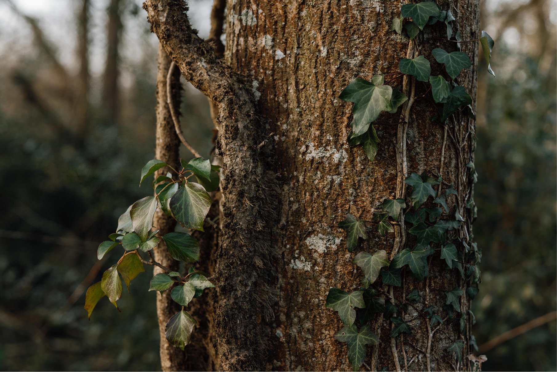
The Hideaways is a collection of handcrafted cabins set within the rolling countryside of Devon. Designed as a place to slow down, reconnect, and breathe, each cabin is thoughtfully positioned to immerse guests in the surrounding landscape – from ancient oak forests to open meadows and winding brooks. We partnered with founder Callum to shape the brand and define the vision at its core: a place to live slow.
Born from the rediscovery of a hidden corner of family farmland, The Hideaways presented a rare opportunity to create something deeply considered and rooted in nature. Callum’s approach – building the cabins himself using sustainable practices, reclaimed materials, and local craftsmanship – gave the project authenticity and integrity from the outset.
The challenge was to translate this into a brand that felt as intentional as the physical space. It needed to appeal to a design-conscious audience seeking escape from fast-paced, digital-heavy lives, while clearly positioning The Hideaways as a premium, experience-led destination – one that balances simplicity with quality, and nature with comfort.
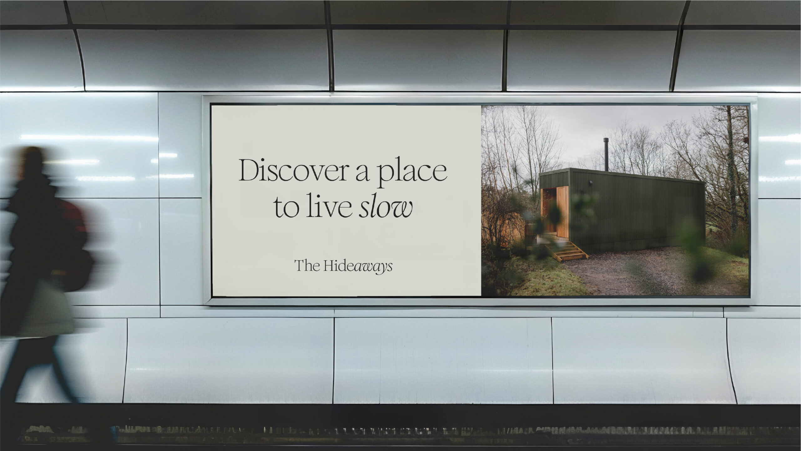
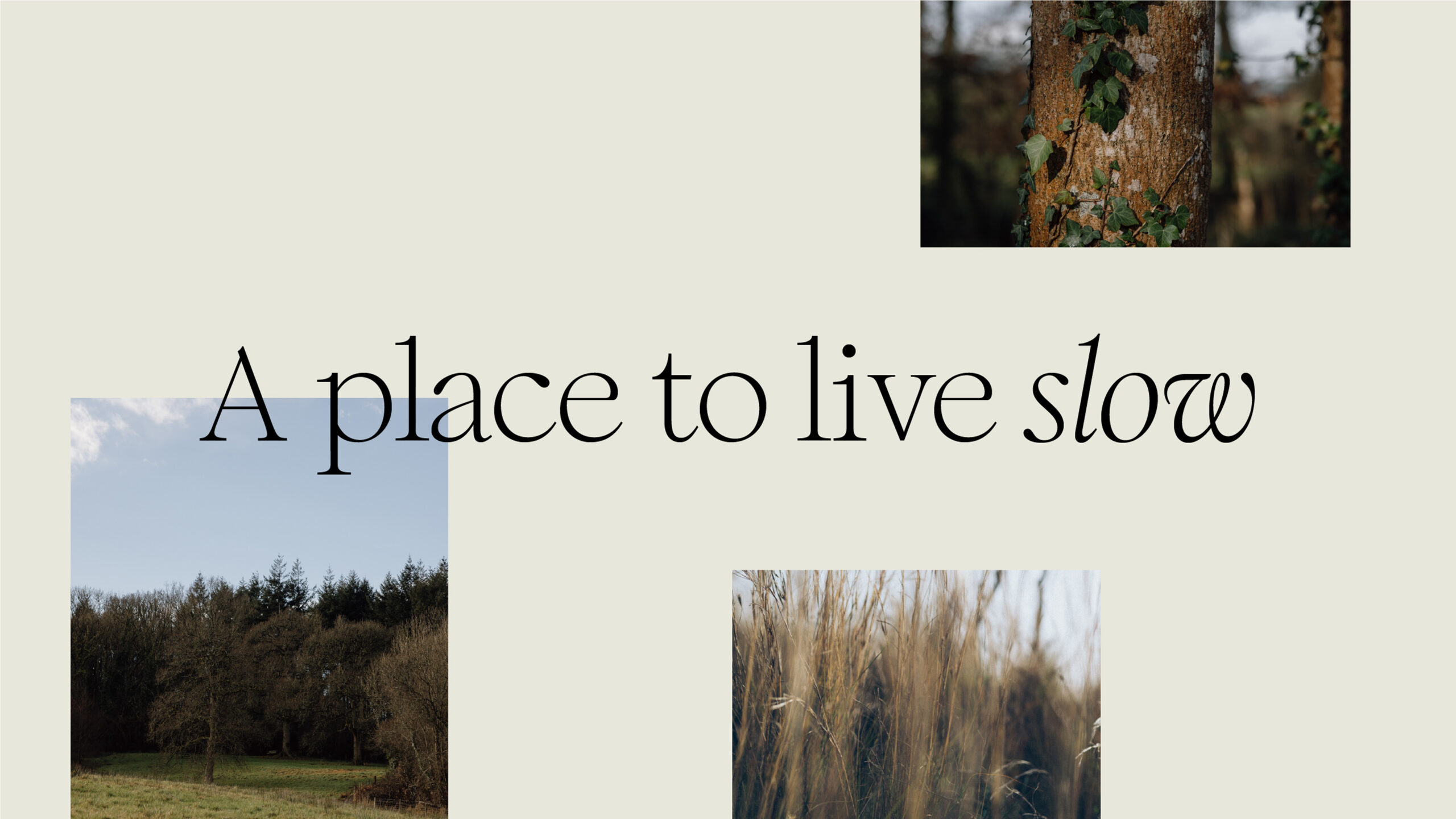
We built a complete brand world around the central idea: a place to live slow. Rather than framing the experience as an escape from responsibility, the brand positions The Hideaways as a sanctuary – somewhere to step away from digital noise and reconnect with what matters most.
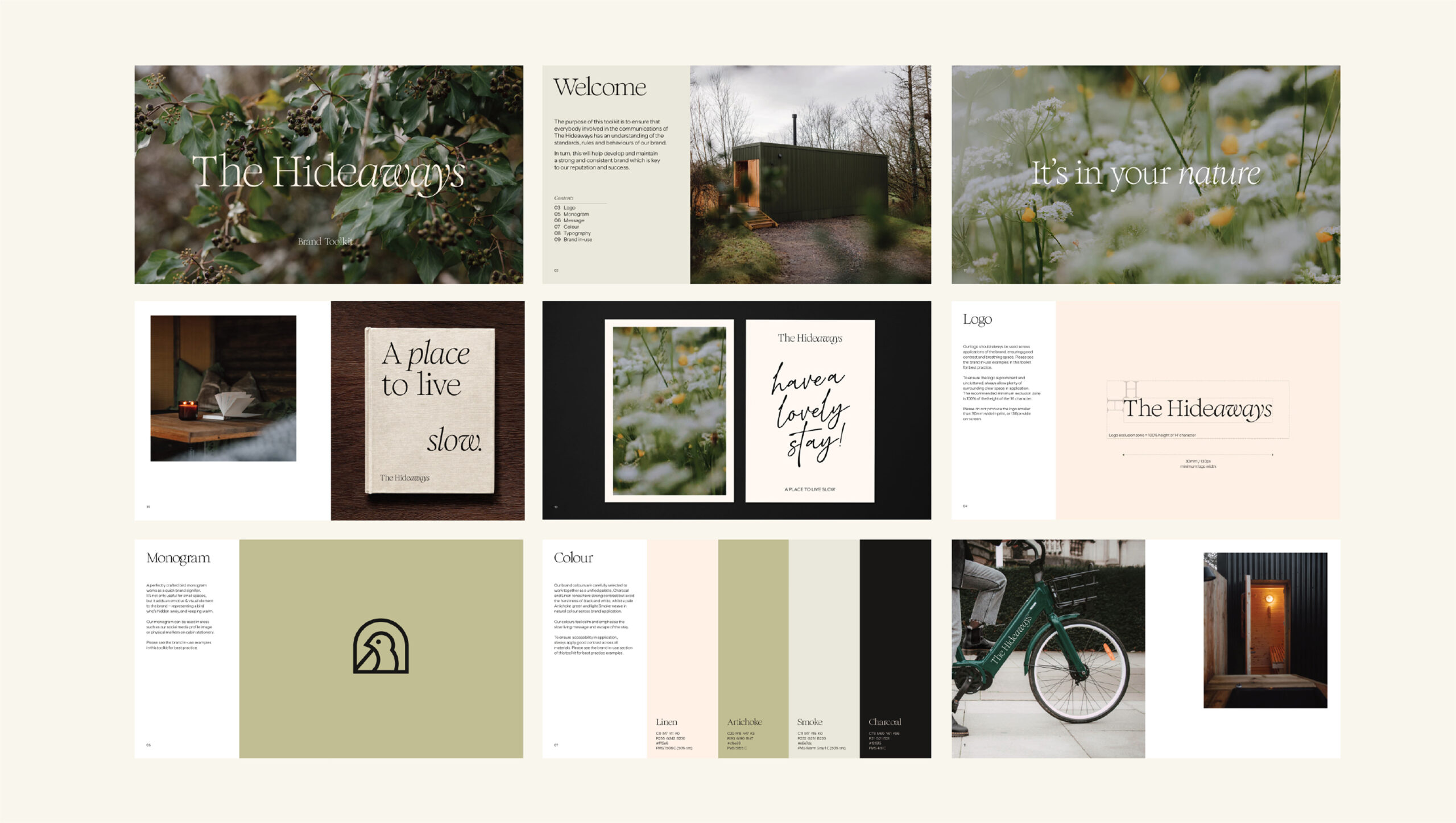
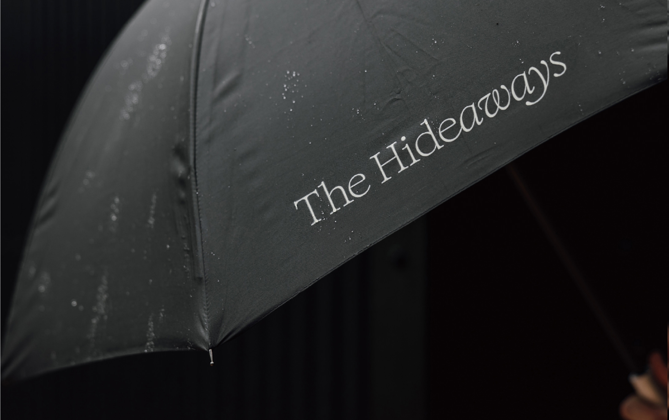
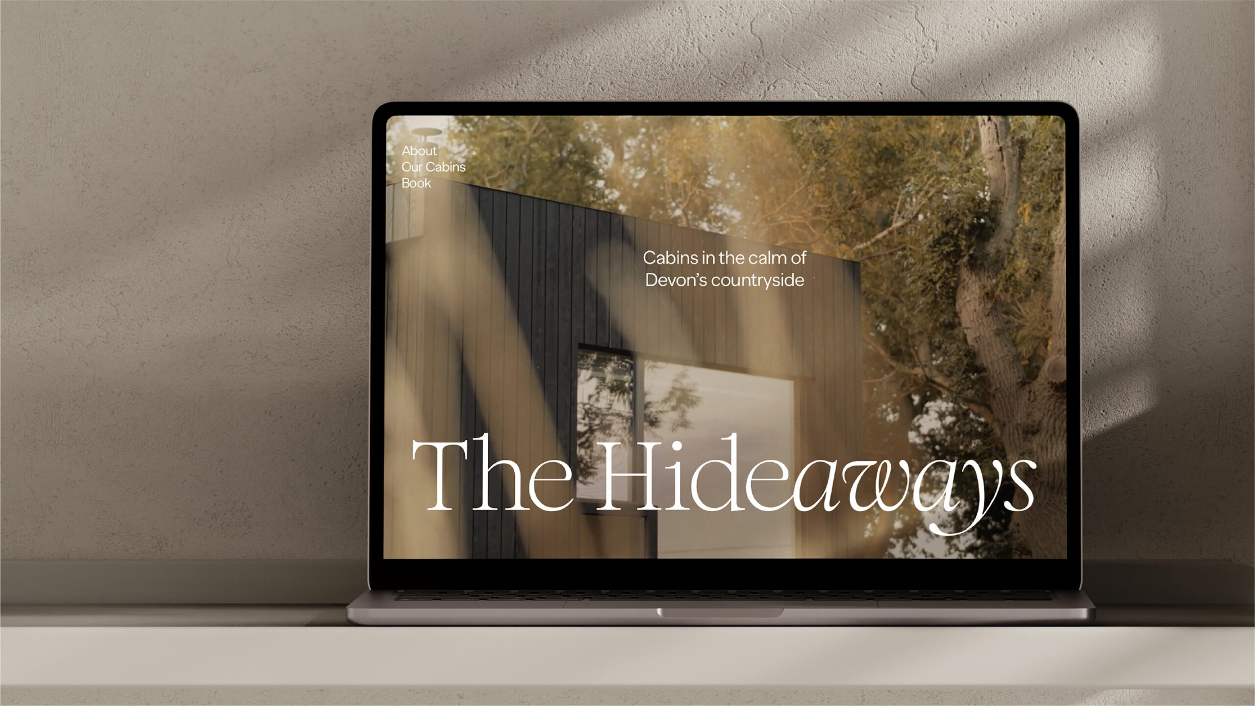
The identity expresses a refined, contemporary calm. Typography plays a key role, combining bespoke serif and sans-serif styles to create a balance between tradition and modernity. A subtle shift within the wordmark – Hide/aways – highlights the idea of ‘aways’, reinforcing the sense of escape while making the logo distinctive and ownable.
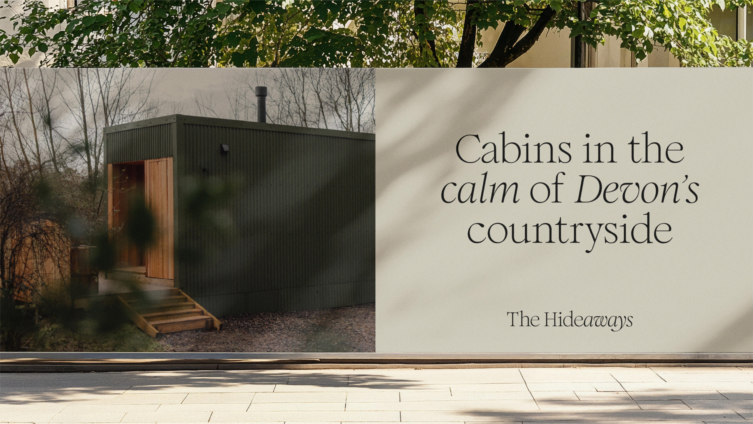
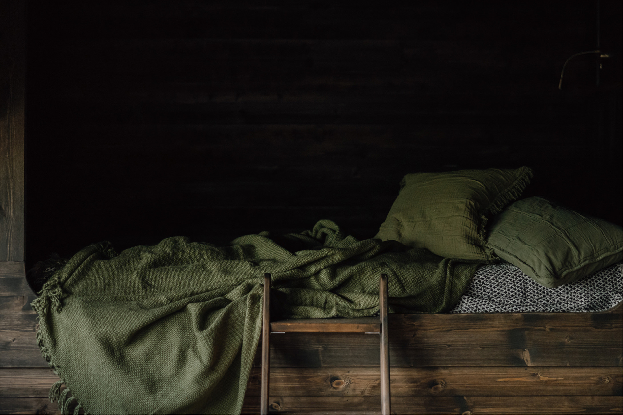
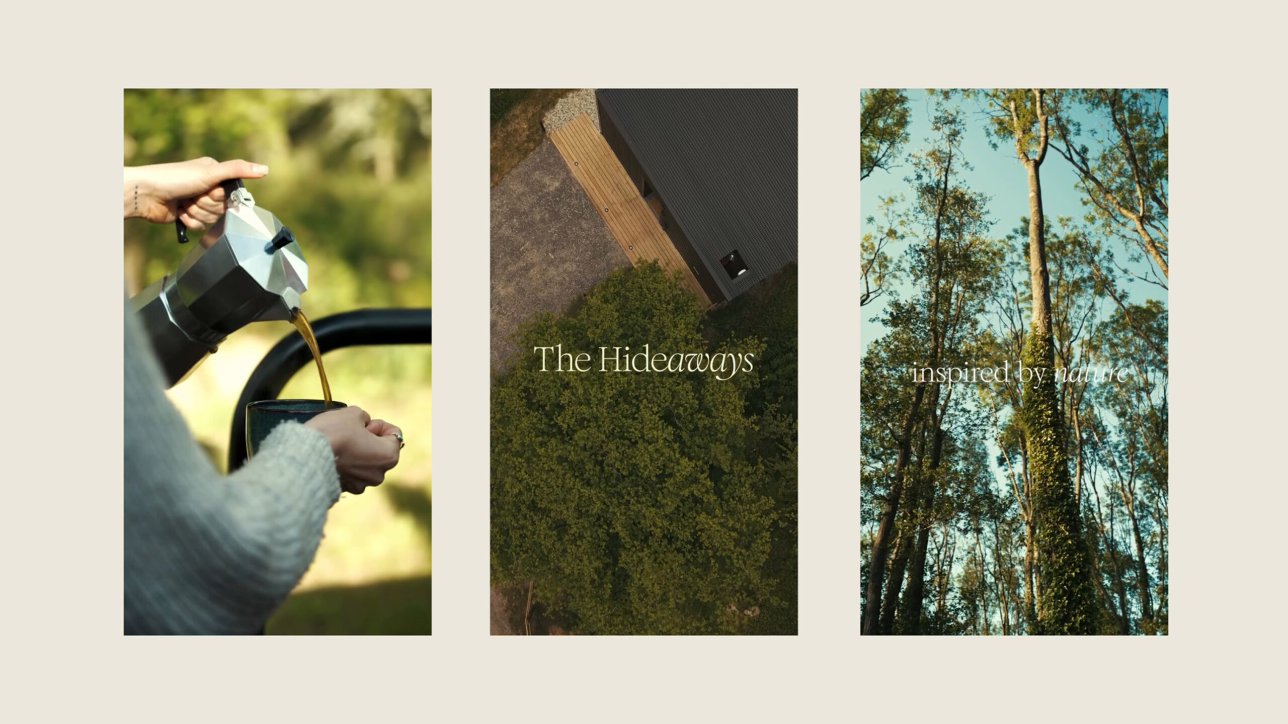
The colour palette is soft and cohesive, with charcoal and linen tones providing contrast without harshness, complemented by muted hues like artichoke green and smoke. Together, they evoke warmth, calm, and a connection to the natural surroundings.
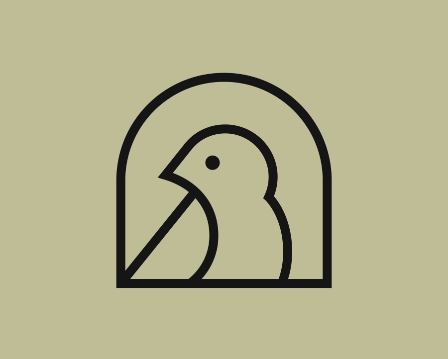
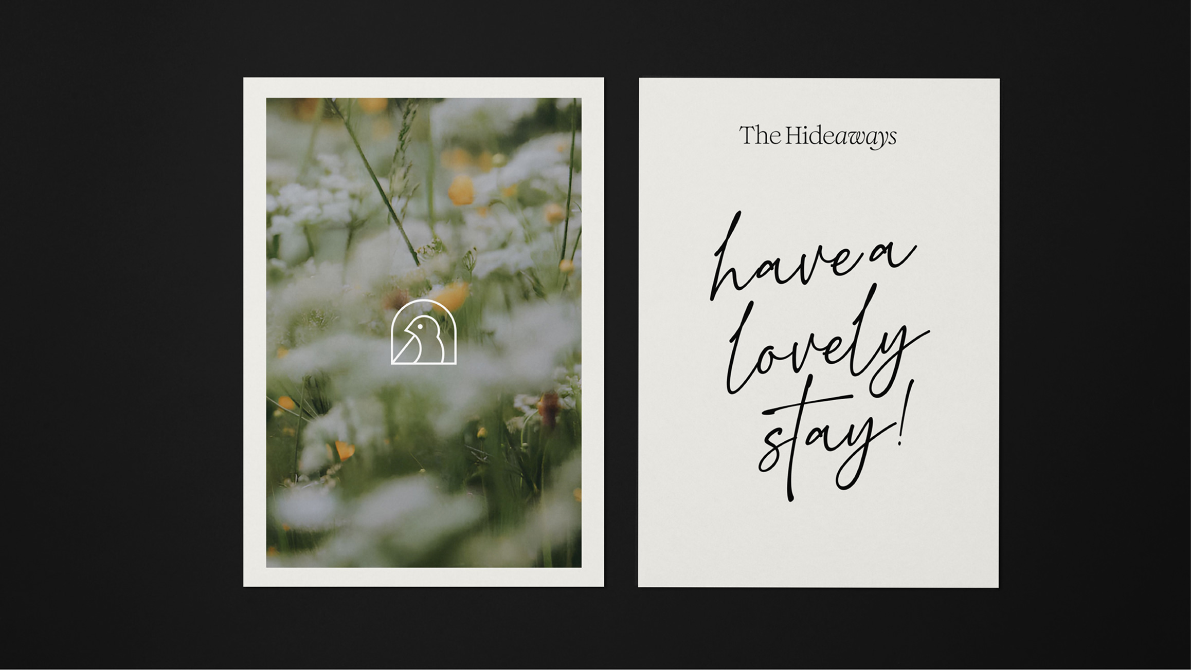
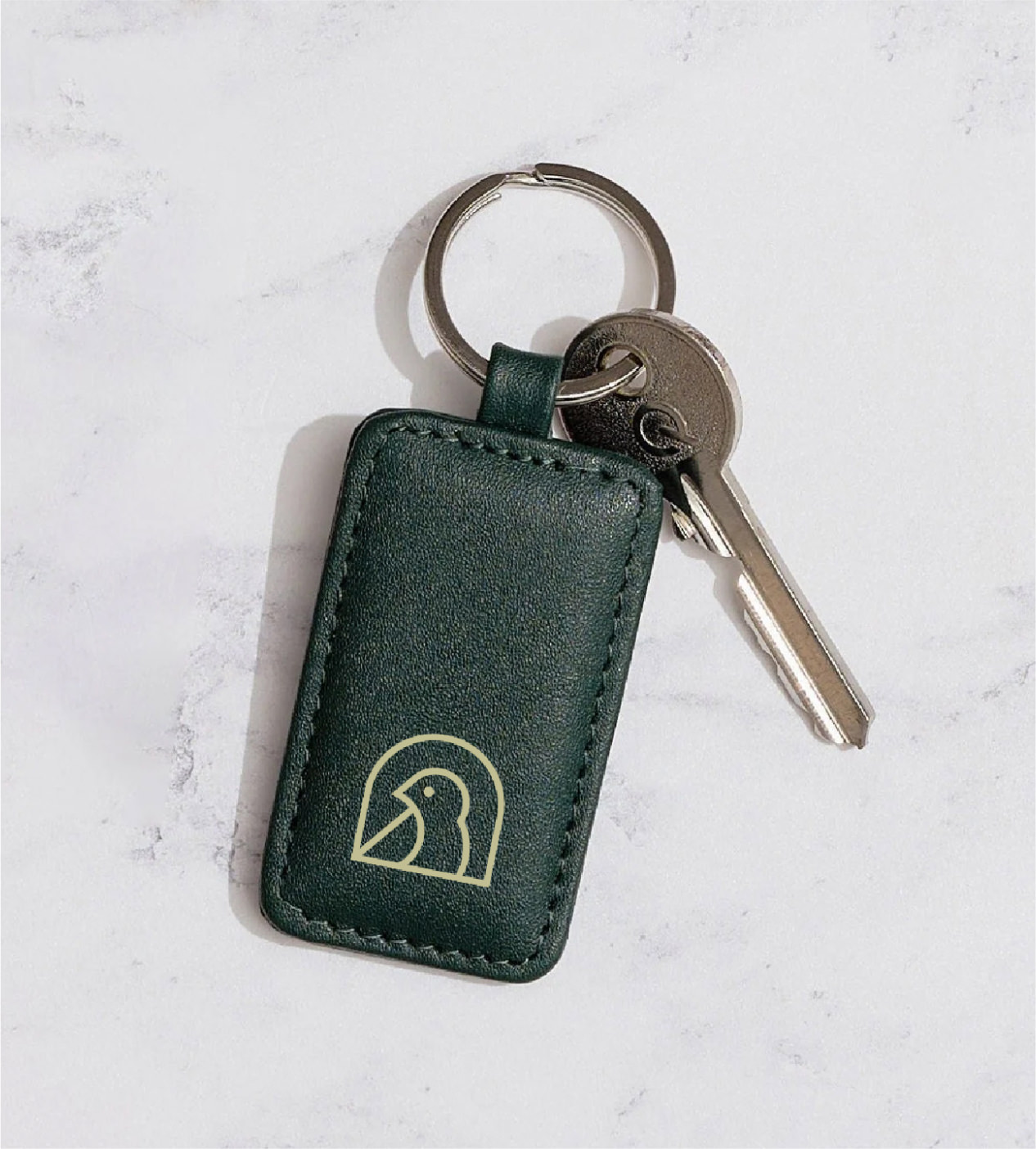
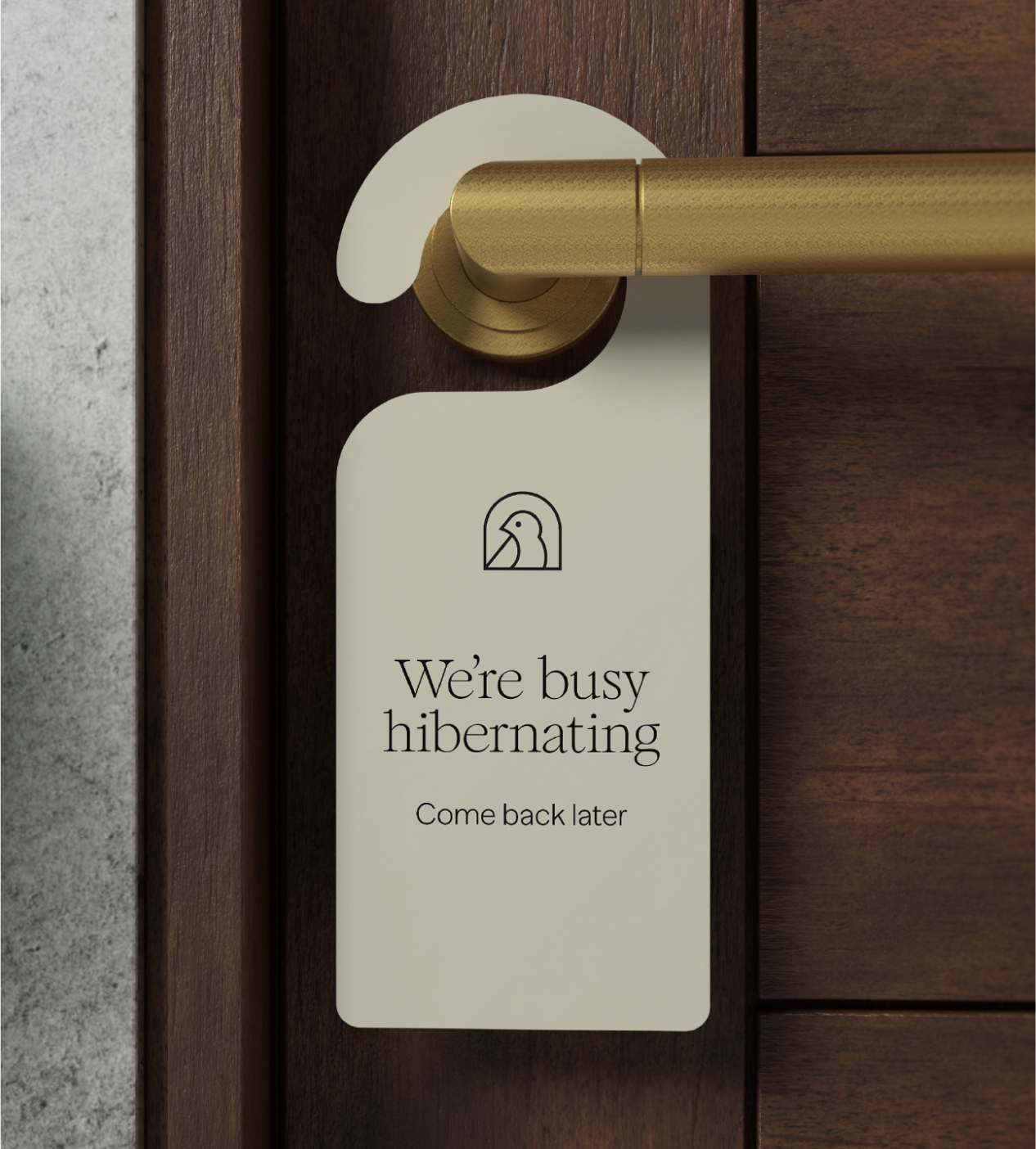
A crafted bird monogram acts as a simple, recognisable brand mark. Beyond its functional role, it adds an emotive layer – symbolising shelter, warmth, and the feeling of being quietly tucked away.
Across every touchpoint – from strategic positioning through to guest welcome materials – the brand creates a cohesive, elevated experience that reflects the quality of the cabins themselves. It’s a world that celebrates slow, intentional living, while delivering a sense of comfort, craft, and quiet luxury.
The Hideaways are a collection of handcrafted cabins nestled in the rolling Devon countryside. They offer space to breathe, time to reconnect and a place to live slow.
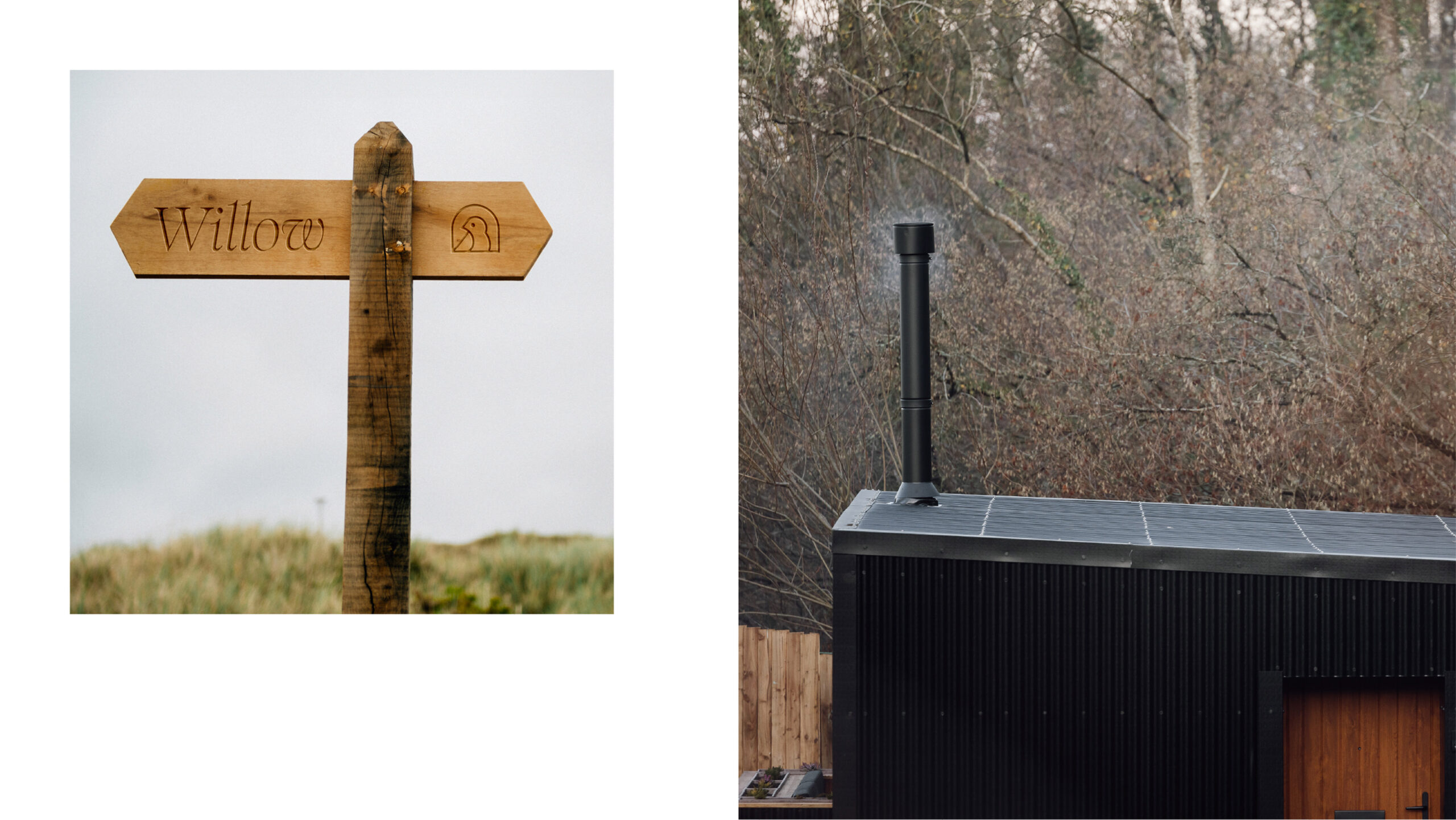
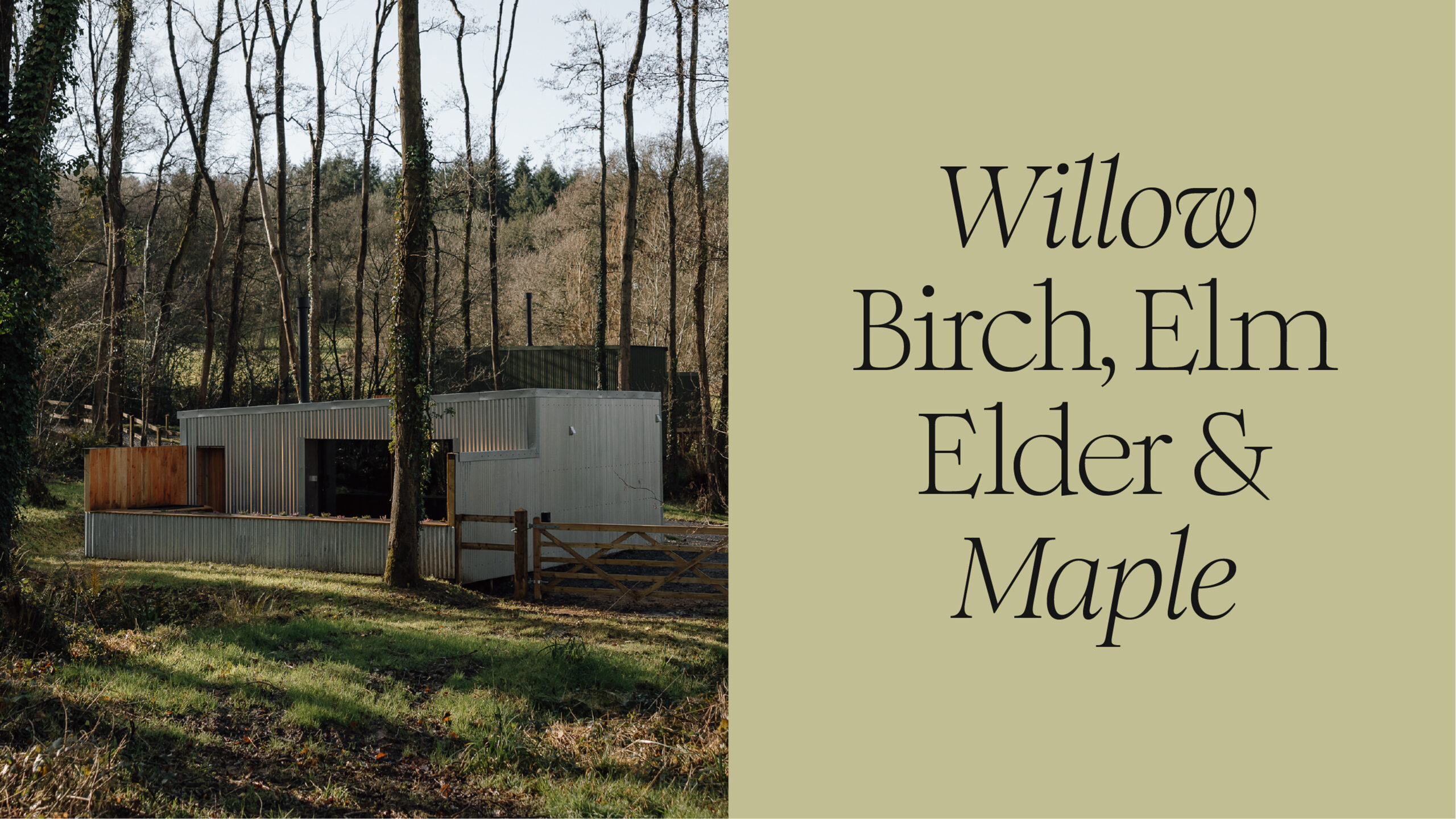
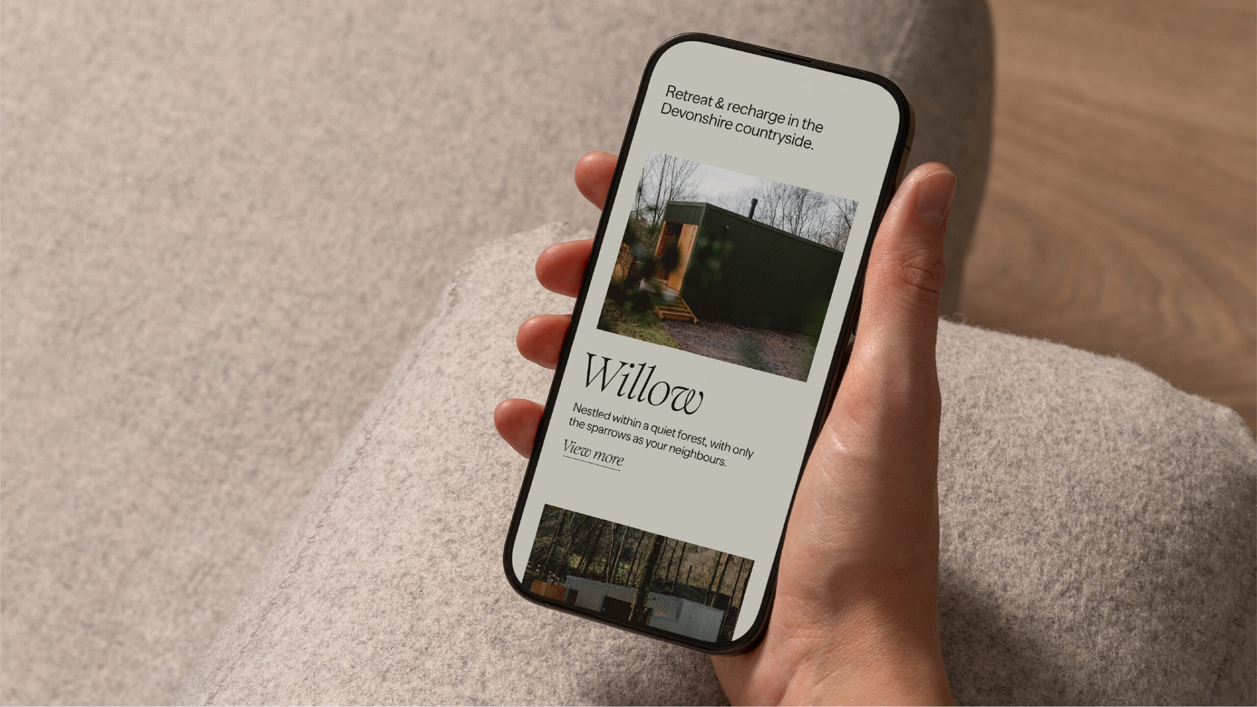
Callum, owner of The Hideaways, approached us with a truly unique project. After re-discovering a hidden corner on his family farm. A dense ancient oak forest, next to a wild, open meadow, and with gentle brooks meandering through the land – he knew immediately that it was the start of something special. He imagined cabins thoughtfully placed to highlight these different relationships with the natural world.
It soon became a reality – Callum built a range of unique cabins himself, with sustainable building practices, re-use of buildings & materials, and special collaboration with local craftspeople.
We helped to build the overarching brand, and define the concept at the very heart – A place to live slow.
This vision isn’t an escape from responsibility, but an idea of sanctuary where guests can temporarily step away from the digital noise, to reconnect with themselves and what matters most.
We crafted a complete brand world for The Hideaways, from the strategic positioning right through to the welcome materials for every guest. The brand strikes a feeling of refined, contemporary-calm. It speaks to a design-conscious target audience, who seek an escape from their busy lives. It celebrates nature and slow, simple living, but ensures this is not only for outdoor activities. It’s a brand that represents high quality in every way, and unique experiences that allow us to reset.
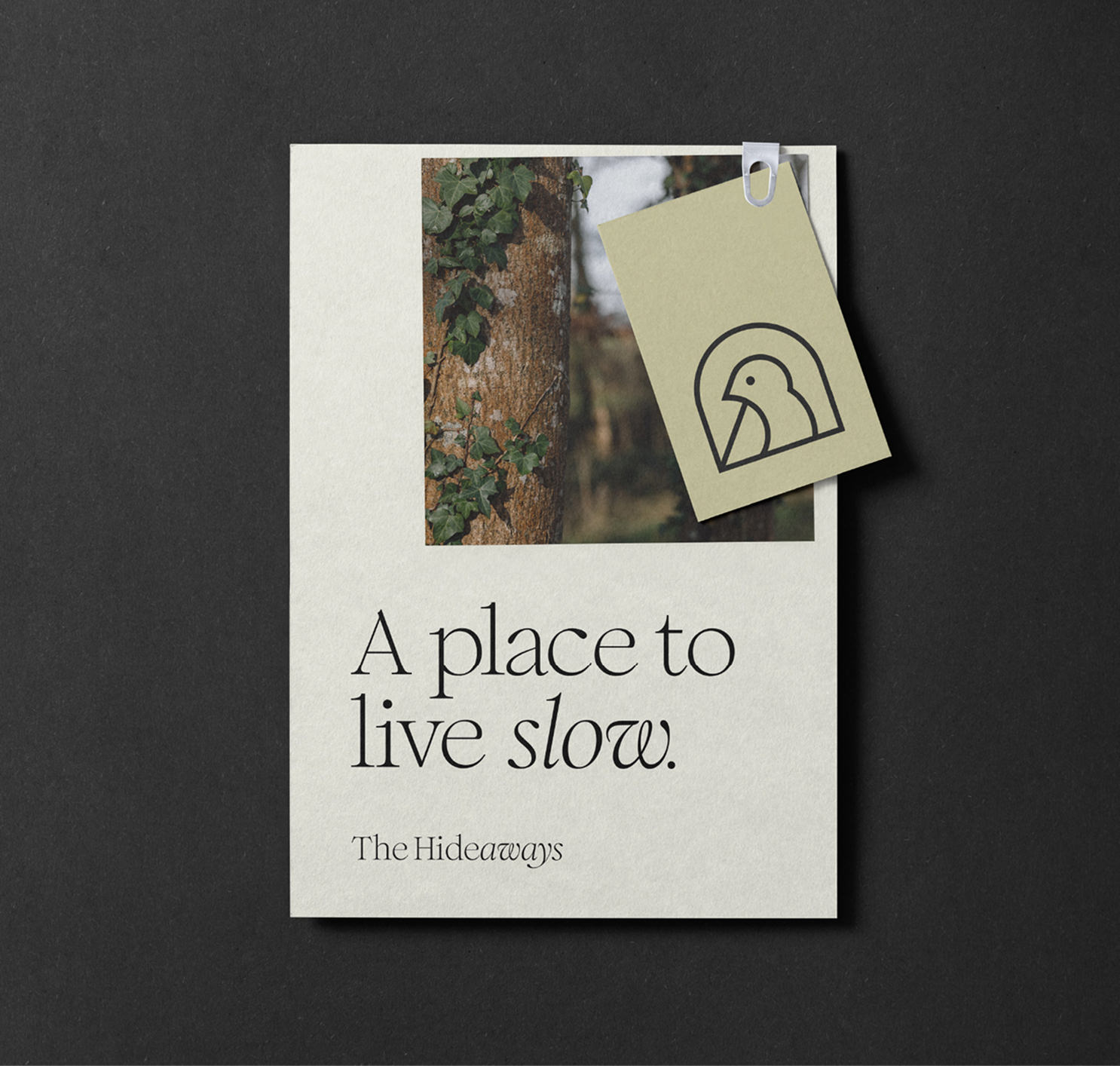
Bespoke and refined typography adds a feel of quality and craft to the brand. It has a hint of tradition, but pairs with a contemporary look and feel to create a balanced brand that aligns to the purpose message. A subtle but key change in typography style in ‘Hide/aways’ plays on the word pairing and emphasises the escape of ‘aways’, whilst making the logo unique and ownable. The brand uses a mixture of serif and sans serif typography to emphasise messaging, but remain calm and in-harmony to other brand elements. It’s warm, welcoming and refined.
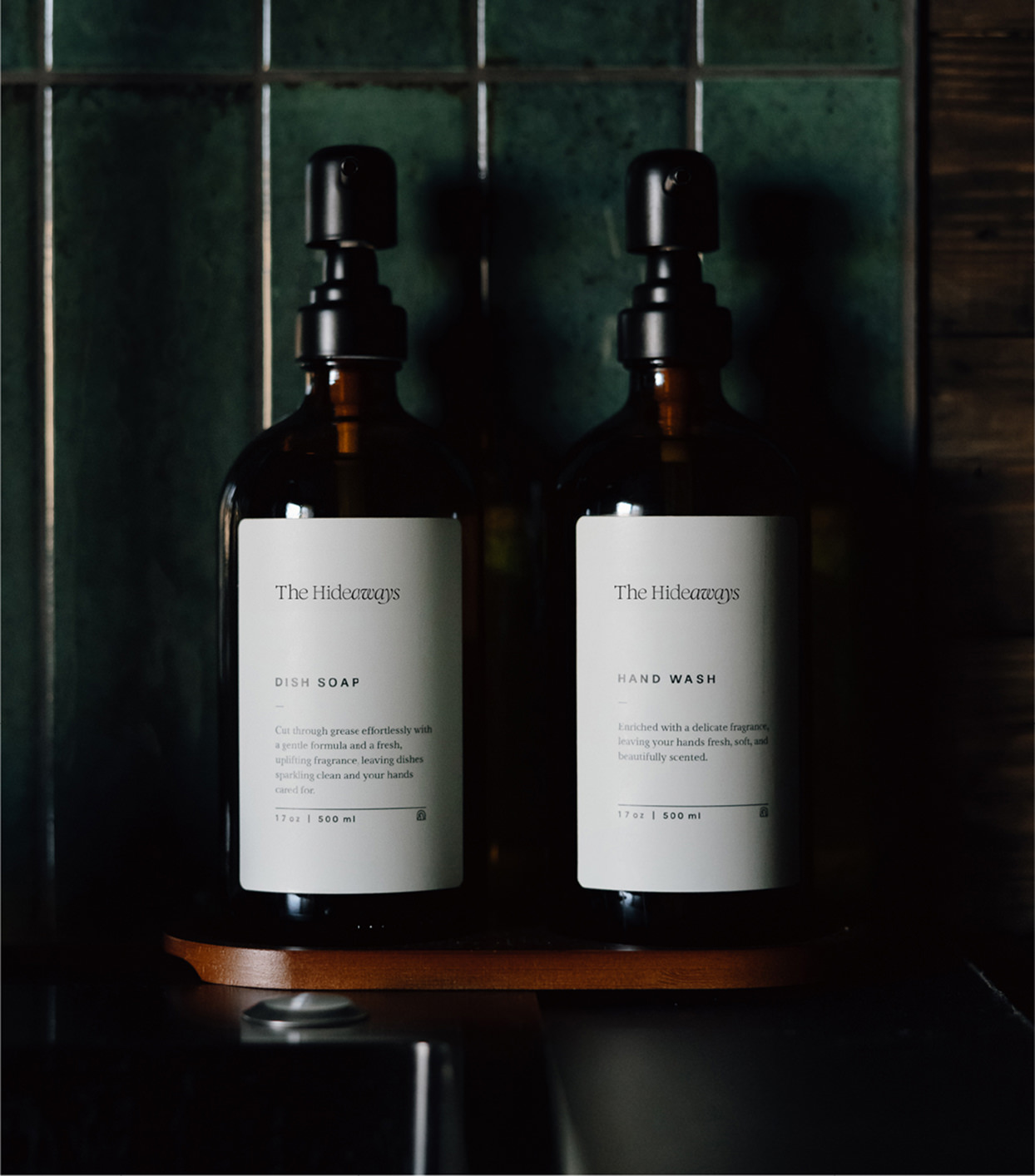
Brand colours are carefully selected to work together as a unified palette. Charcoal and Linen tones have strong contrast but avoid the harshness of black and white, whilst a pale Artichoke green and light Smoke weaves in colour across brand application. The colours feel calm and emphasise the slow living message and escape of the stay.
A perfectly crafted bird monogram works as a quick brand signifier. It’s not only useful for small spaces, but it adds an emotive & visual element to the brand – representing a bird who’s hidden away and warm.