Subi gives real estate agents their time back by simplifying transactions through smart, seamless automation. Designed to support growing portfolios, the app removes the friction and frustrations that often come with listings and sales – helping agents focus on what matters most.
The US real estate space is saturated with tools that feel overly corporate, complex, and impersonal. Agents are often stretched thin, juggling multiple properties while dealing with inefficient processes and constant admin headaches. There was an opportunity to create a brand that not only solves these pain points functionally, but also shifts the emotional experience – making real estate feel lighter, more human, and even enjoyable. A brand that stands apart visually and tonally, while clearly communicating ease and support.
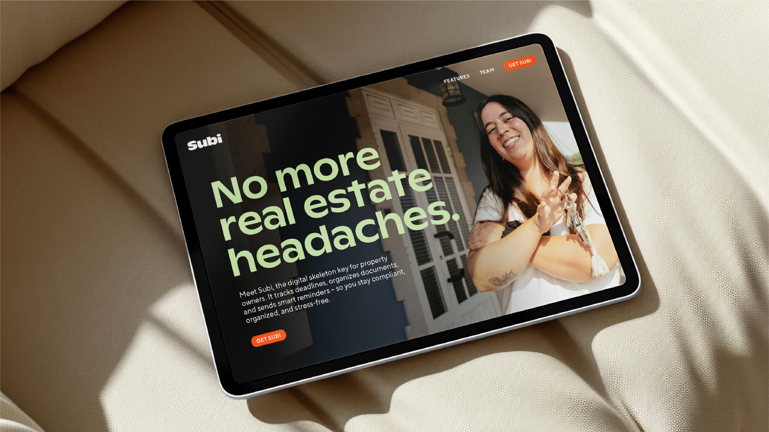
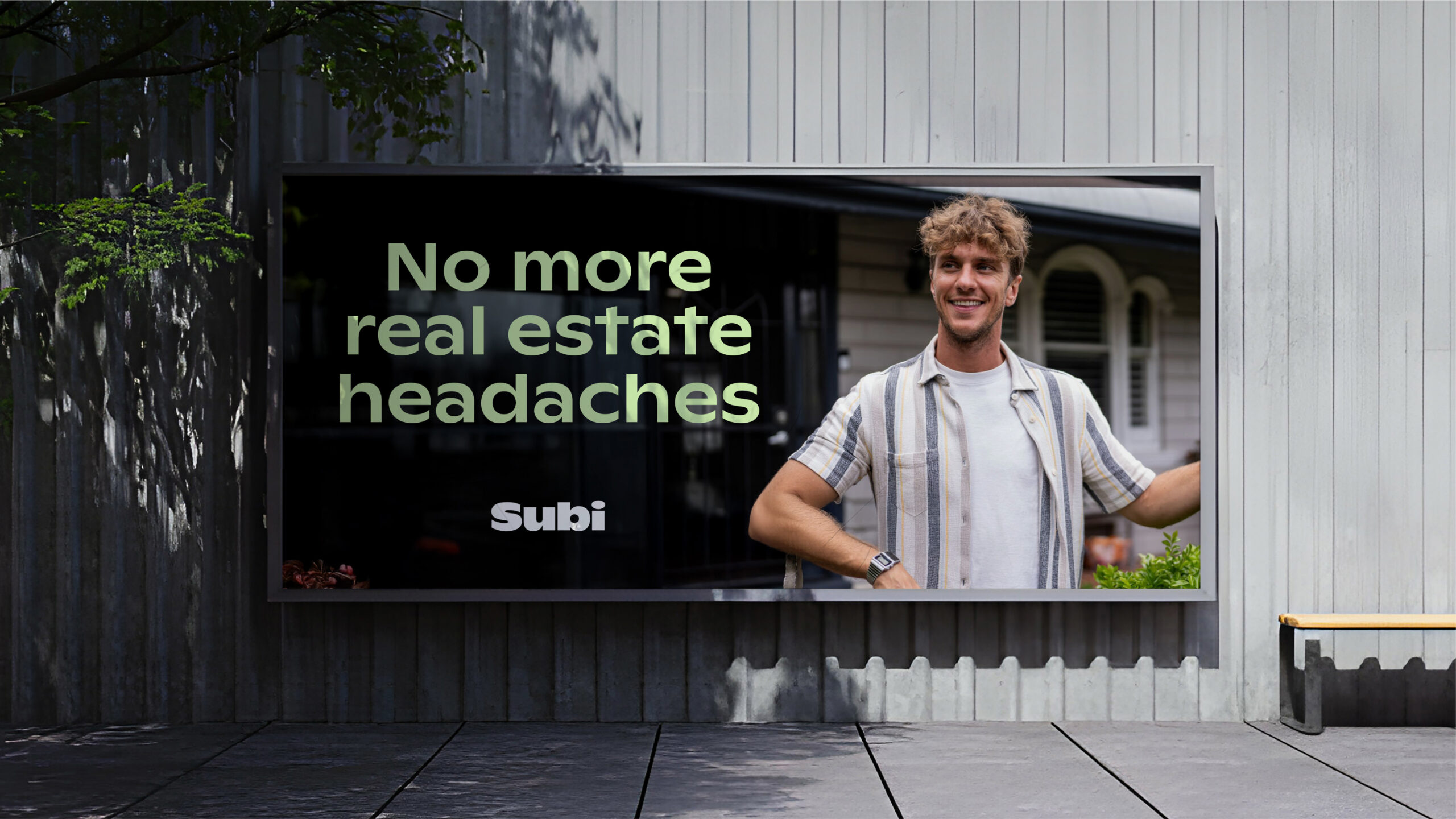
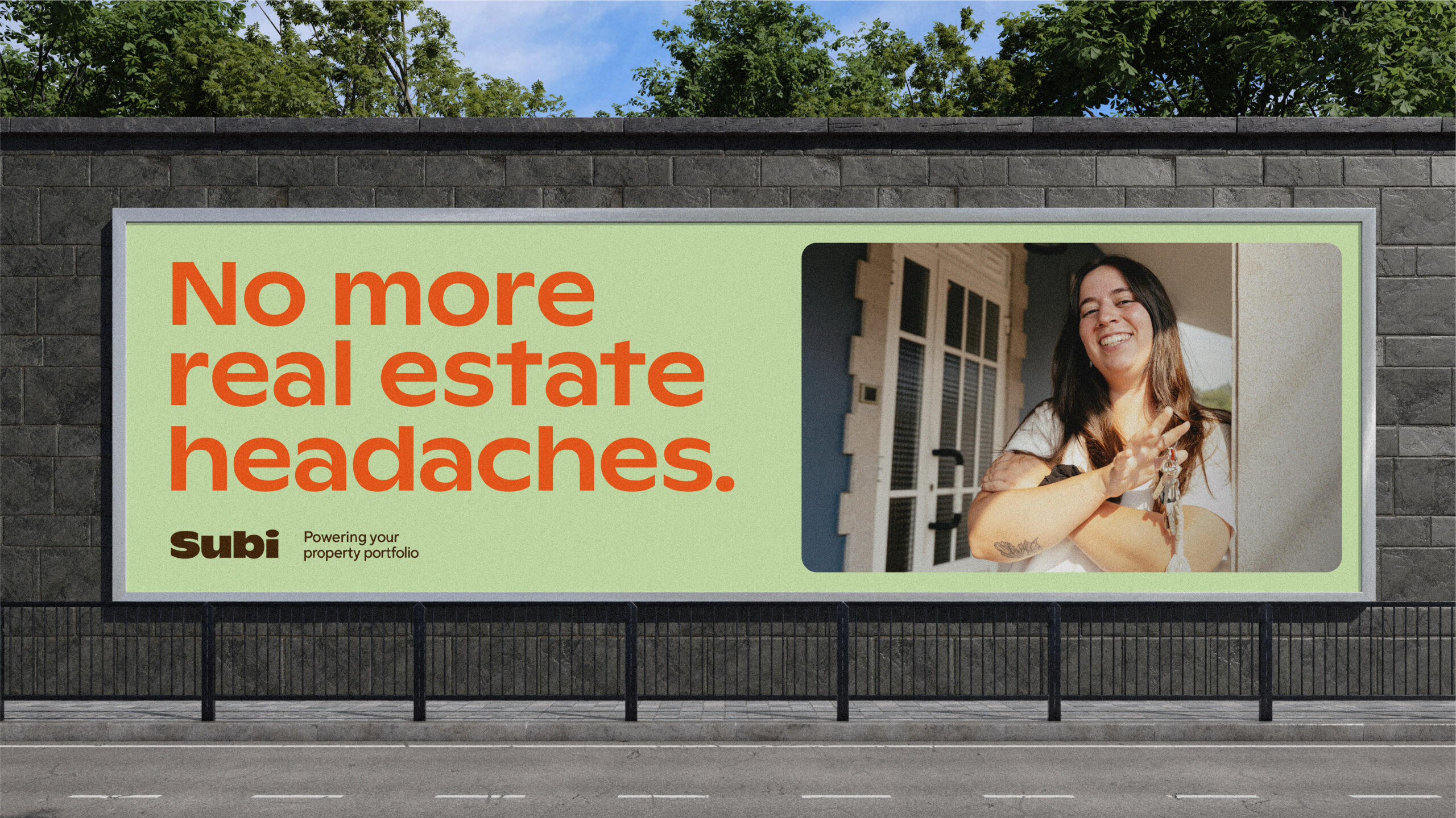
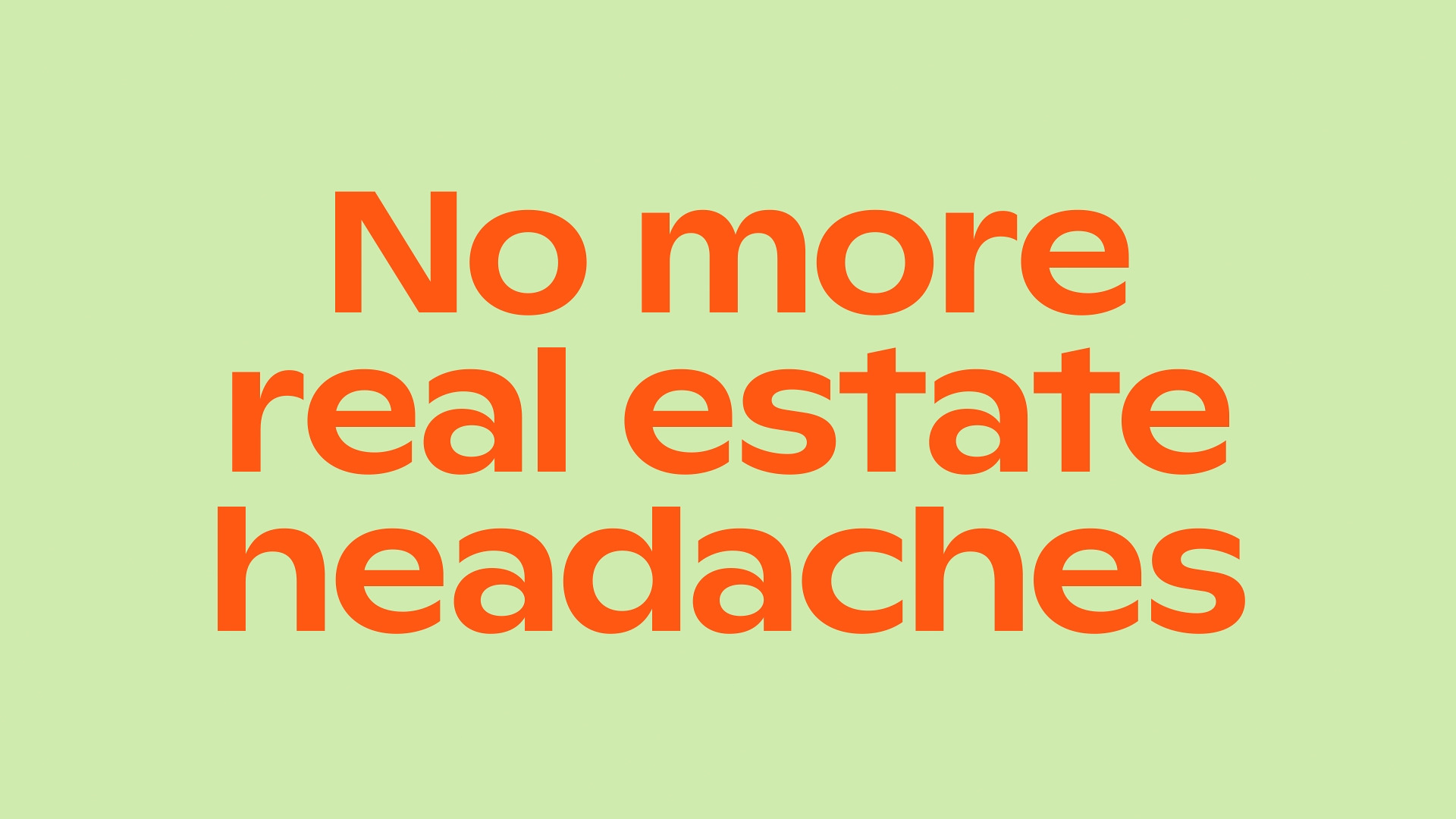
We partnered with Subi to bring the brand to life from the ground up, anchored by the core message: “No more real estate headaches.” It’s a simple, relatable idea that captures exactly what Subi stands for – reducing friction in the day-to-day. When agents have too much on their plate, Subi does the dishes.
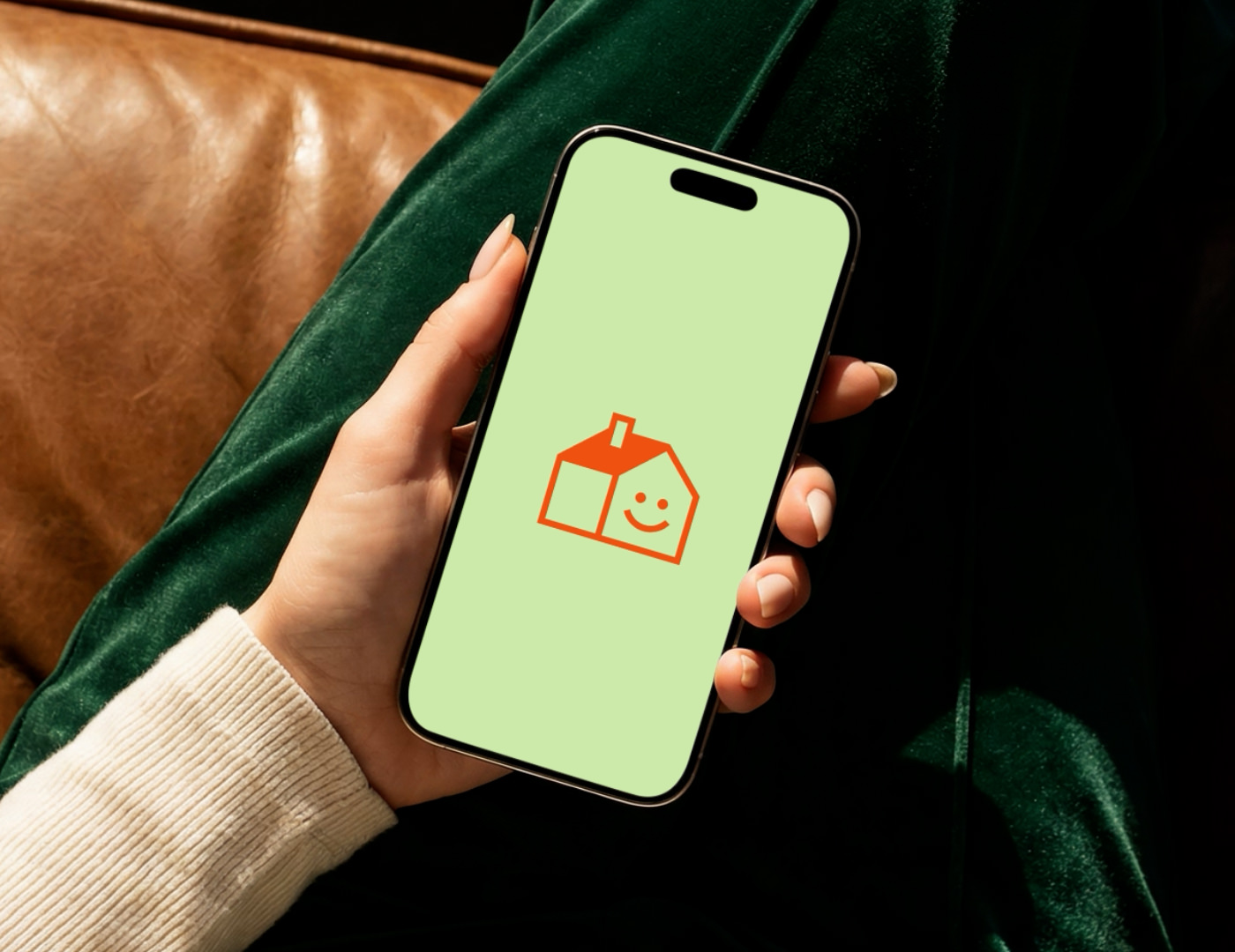
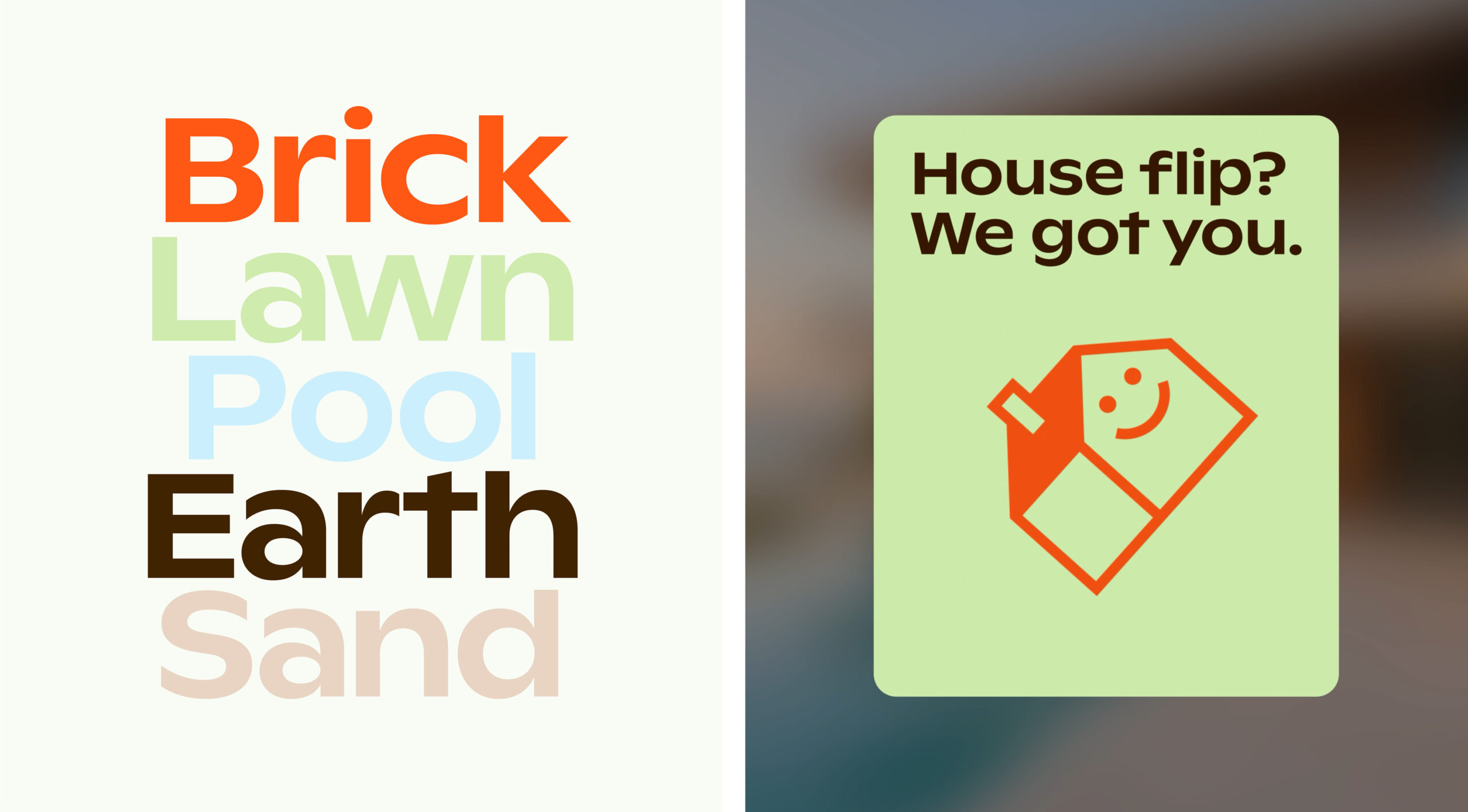
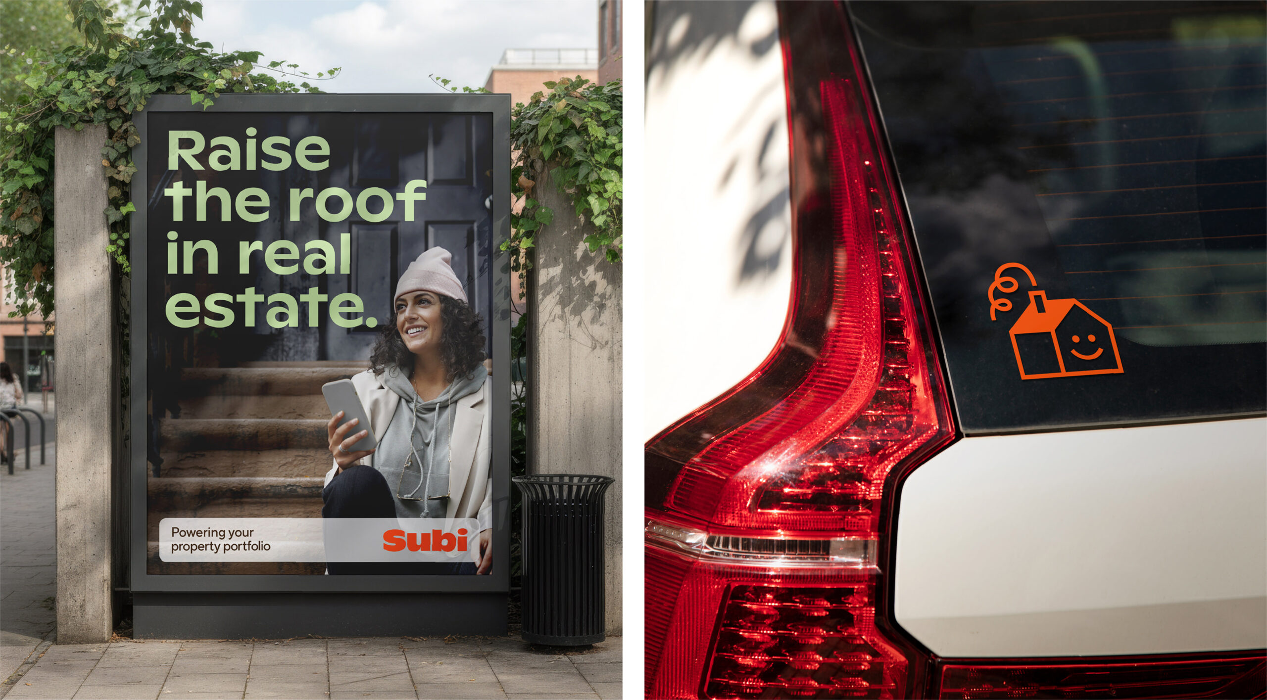
The identity is vibrant, confident, and full of personality – a deliberate move away from category norms. A bold, heavy sans-serif typeface creates impact while remaining approachable, with rounded, chunky forms adding warmth. A bright, energetic colour palette ensures strong differentiation while keeping the brand contemporary and friendly.
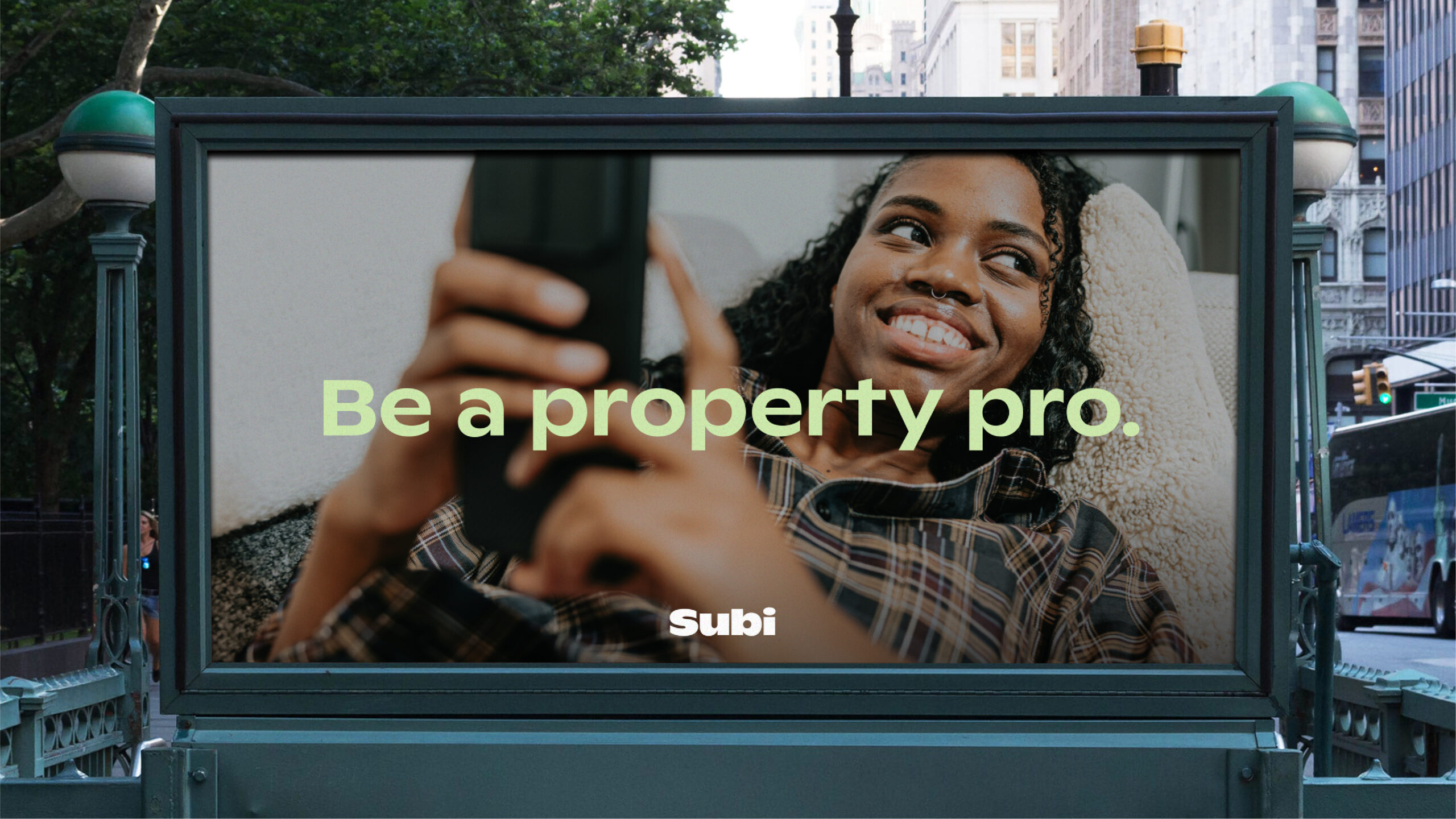
Imagery focuses on agents in their element – at properties, on-site, and using Subi – grounding the brand in real-world contexts while maintaining a human, relatable feel.
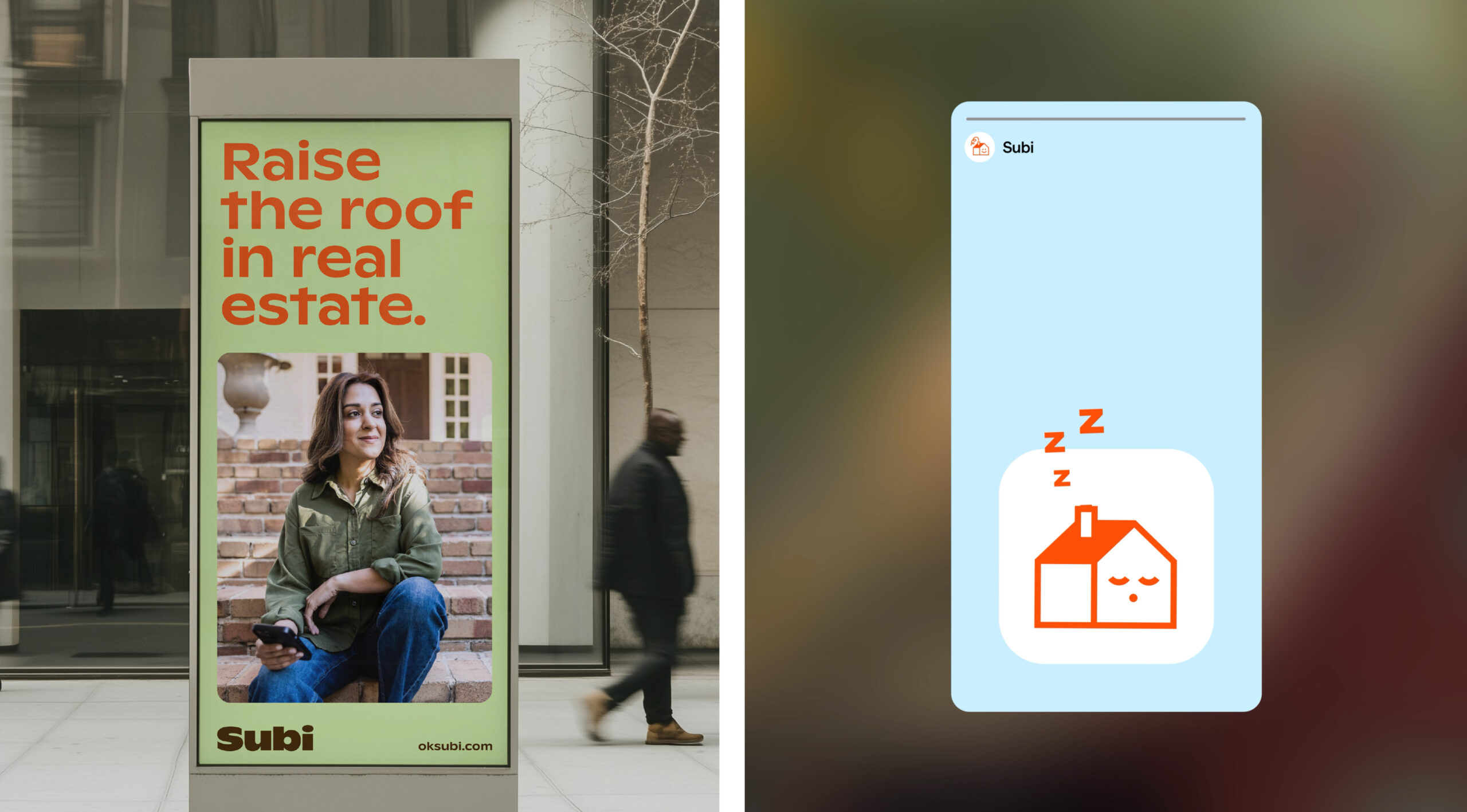
At the heart of the brand is Howie, the Subi mascot. This character introduces a layer of charm and approachability, acting as a playful signal that distances Subi from traditional corporate tones – and makes real estate, dare we say it, fun.
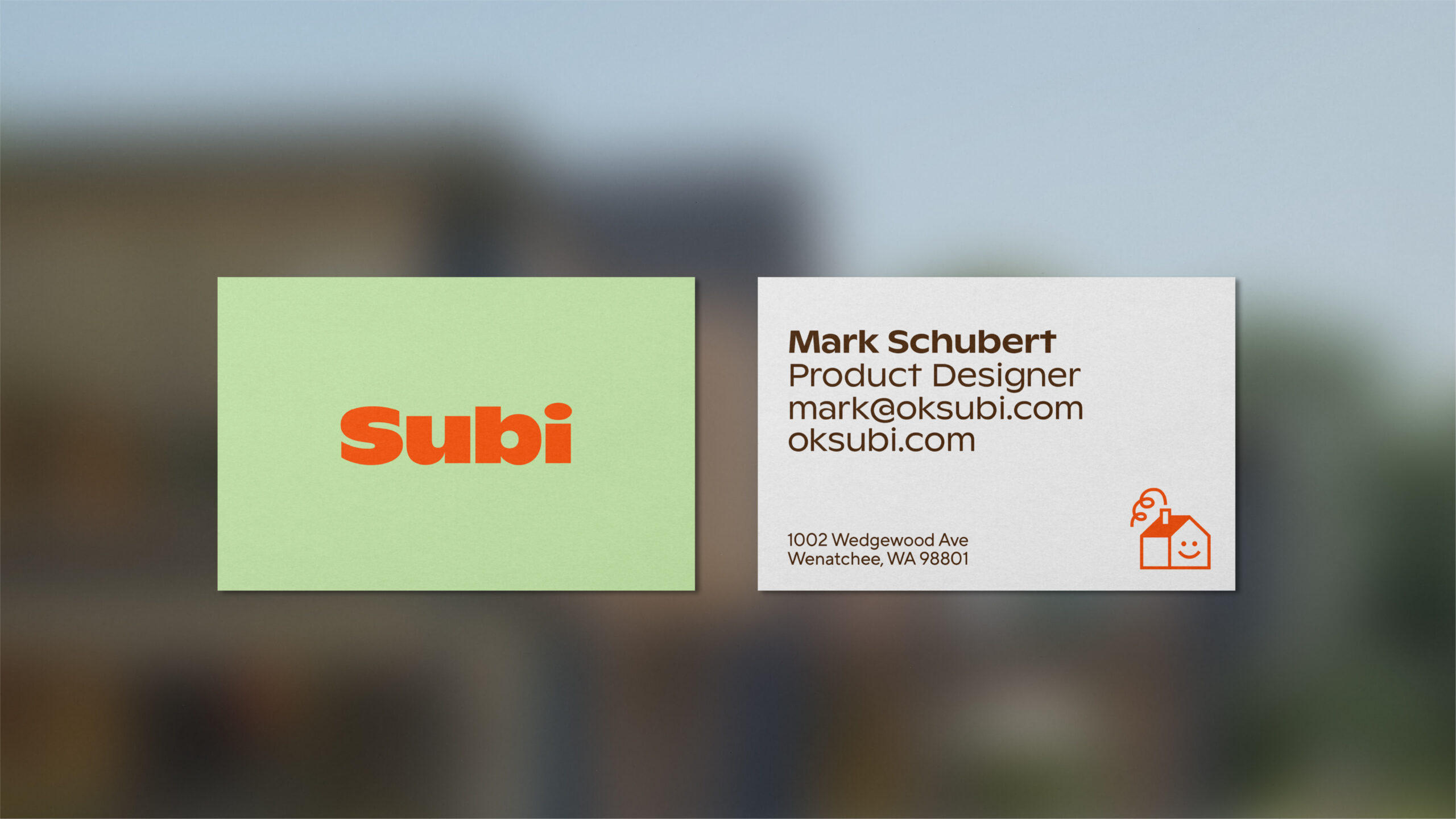
We developed the full brand world and key launch collateral, supporting Subi’s rollout across the US in 2025.
Subi gives real estate agents their time back by simplifying transactions through smart, seamless automation. It’s an app designed to support growing portfolios and prevent the little (and not-so-little) headaches that pop up during listings and sales.
We partnered with Subi to bring the brand to life from the ground up. Our core message – ‘No more real estate headaches‘ – captures exactly what Subi stands for: making the day-to-day feel lighter and easier. When agents have too much on their plate, Subi does the dishes.
The brand is vibrant, confident, and packed with personality – a refreshing shift away from the corporate, predictable feel of the US real estate space. A bold, heavy sans-serif gives the identity impact while staying approachable, with chunky forms and rounded details that add warmth. The colour palette is bright and energetic, helping Subi stand out from competitors while feeling contemporary and friendly.
Imagery centres around agents in their element – at properties, on-site, using Subi – keeping the brand grounded in the industry while still feeling human and relatable.
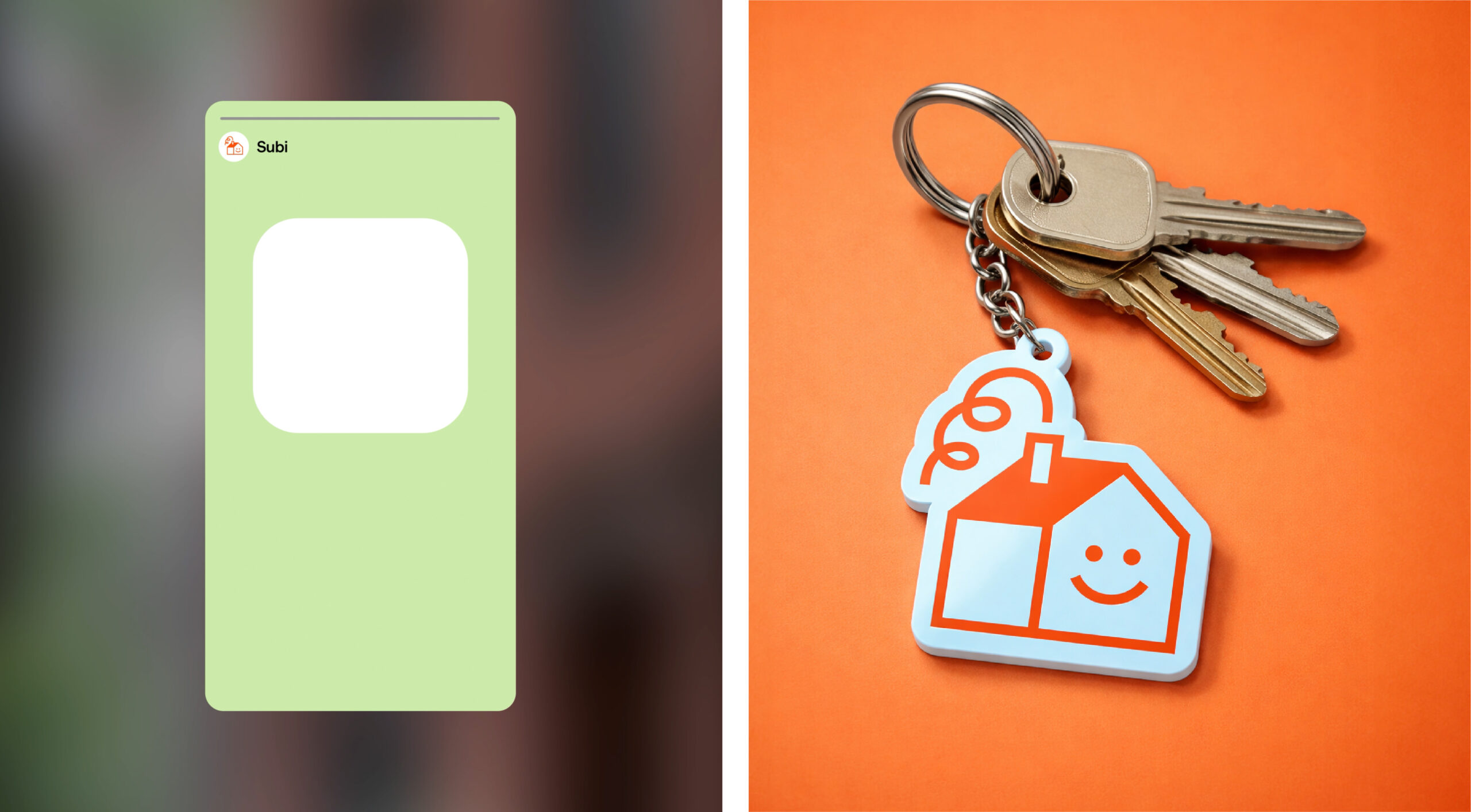
And then there’s Howie, the Subi mascot. This little character brings an extra layer of charm and approachability to the brand. Used thoughtfully throughout, Howie acts as a playful visual cue that nudges Subi away from the corporate world – and makes real estate, dare we say it… fun.
We created the full brand world and key launch collateral, supporting Subi as they rolled out across the US in 2025.