
We partnered with Travel South Yorkshire to develop a campaign that would help more people discover and choose TSY for everyday travel.
Our role was to evolve the brand experience across digital and print touchpoints, creating a campaign that felt clear, relatable and genuinely useful. The focus wasn’t on overcomplicating travel – it was about showing how TSY makes moving around South Yorkshire simpler, more flexible and more dependable.
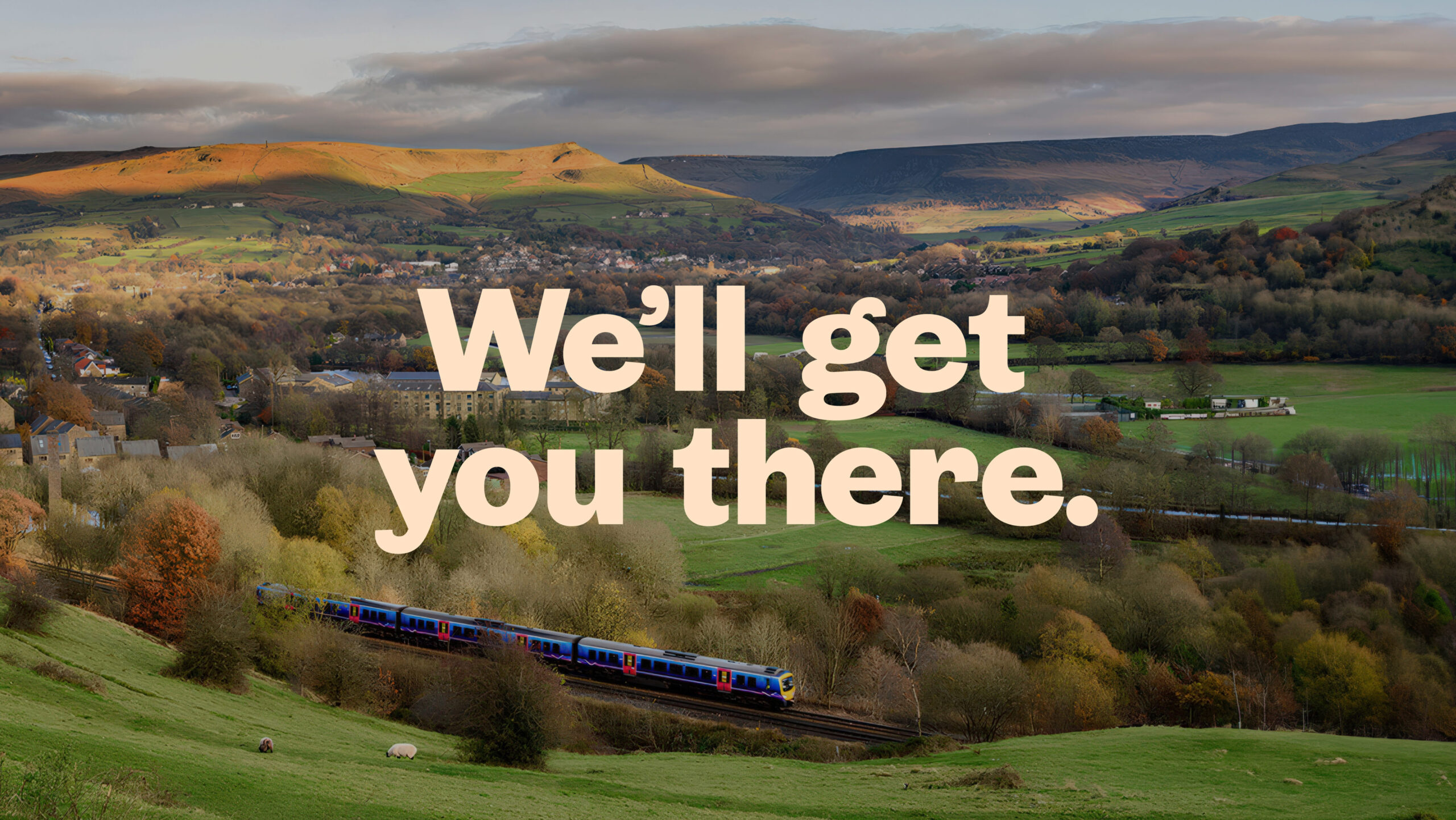
At the heart of the campaign was a straightforward idea: travel matters because of where it takes you – home after work, to family, to friends, to important moments. We built a brand message and visual identity to reflect that emotional connection while staying practical, confident and easy to understand.
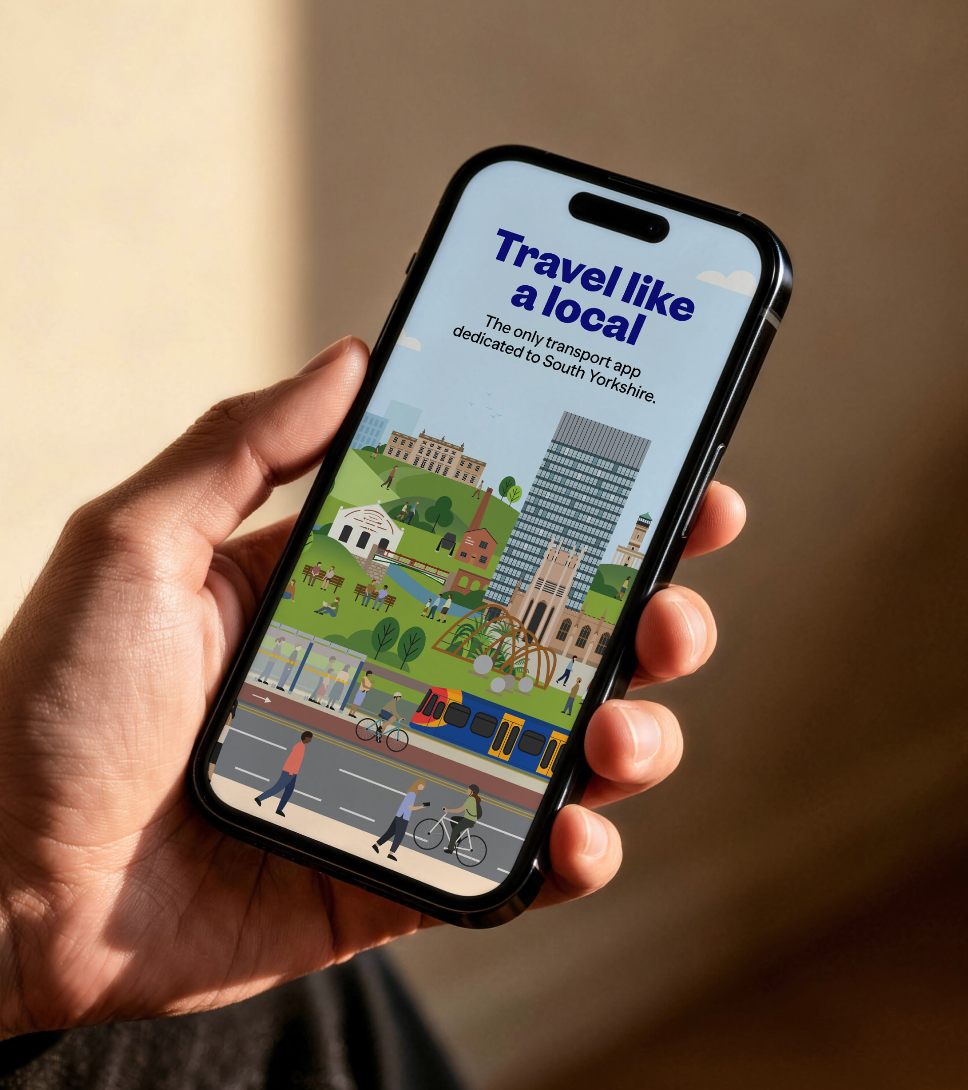
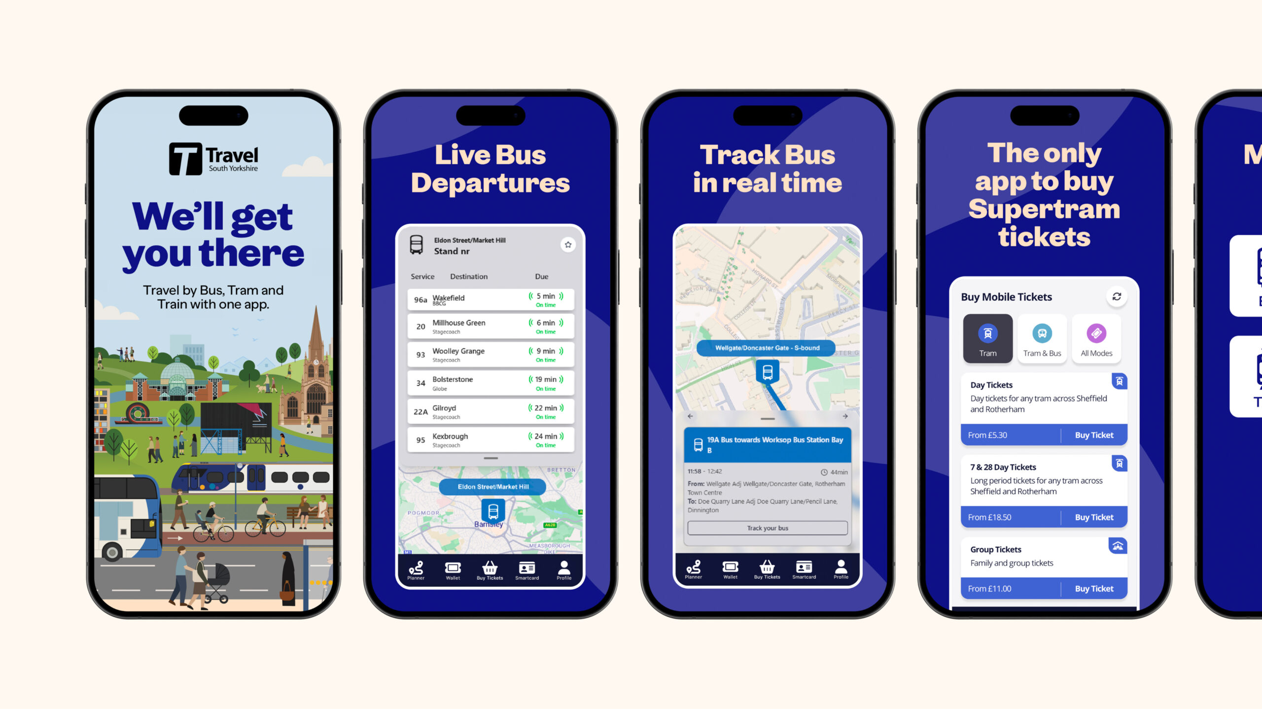
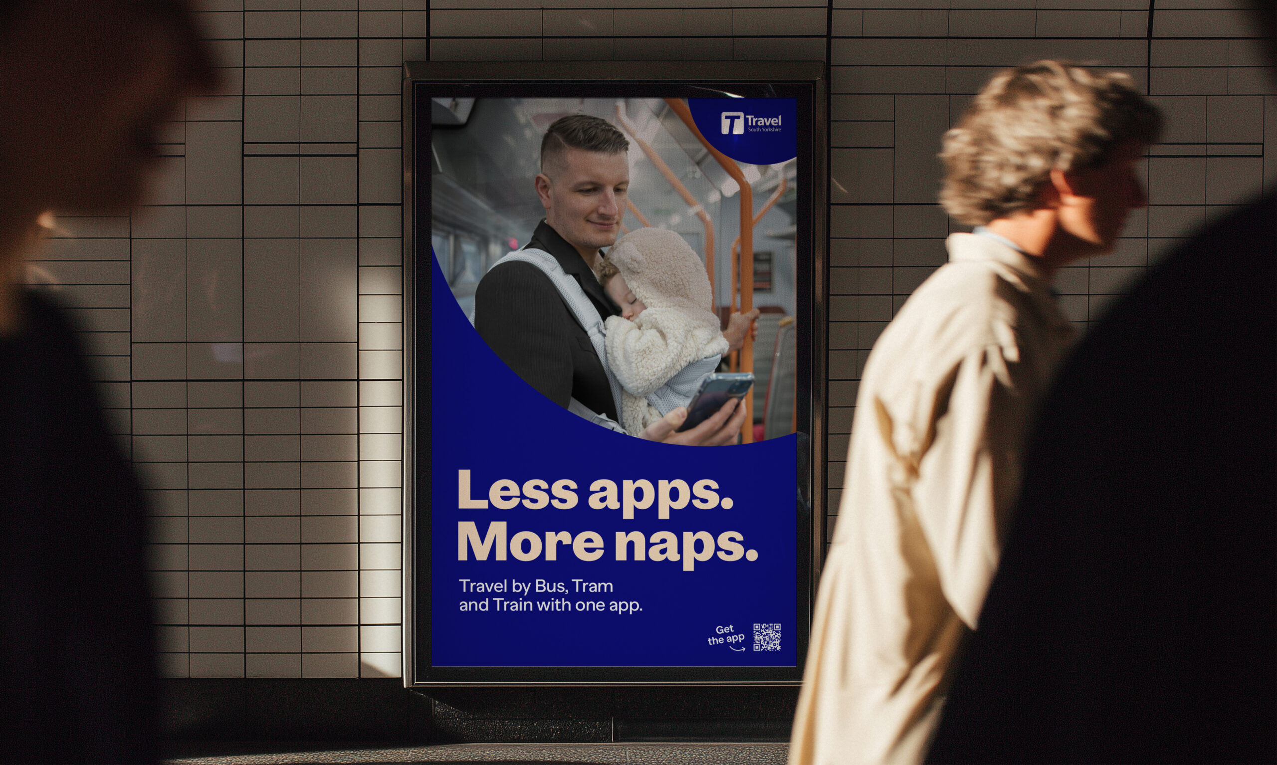
TSY’s biggest strength is its simplicity – one app for bus, tram and train travel. No more juggling multiple apps, tickets, passwords and sign-ups. Less admin = more life.
While many transport apps operate nationally, TSY has a strong regional focus – something we saw as a real strength rather than a limitation. We leaned into that local connection to position TSY as a travel companion built specifically for South Yorkshire. By grounding the campaign in recognisable places, real journeys and everyday experiences, we created something more personal and trustworthy over a generic transport app.
Our insight was simple: people don’t want travel to feel difficult. They want something reliable, intuitive and stress-free. That thinking shaped every part of the campaign – from the messaging and tone of voice to the visual identity and imagery.
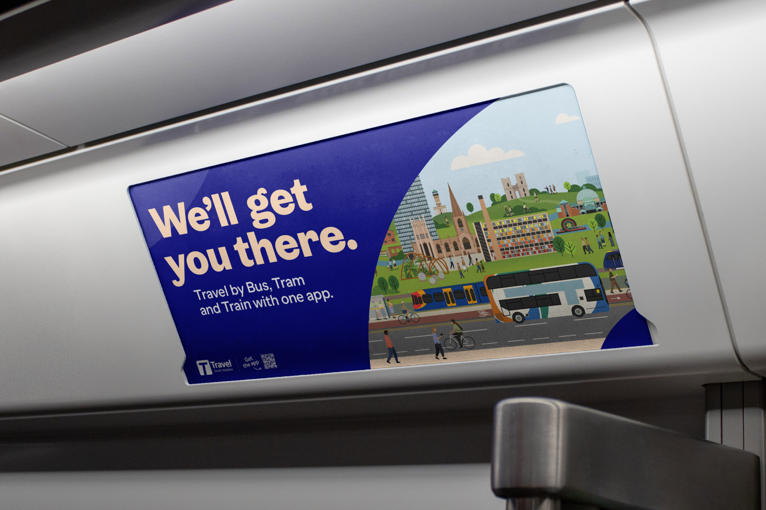
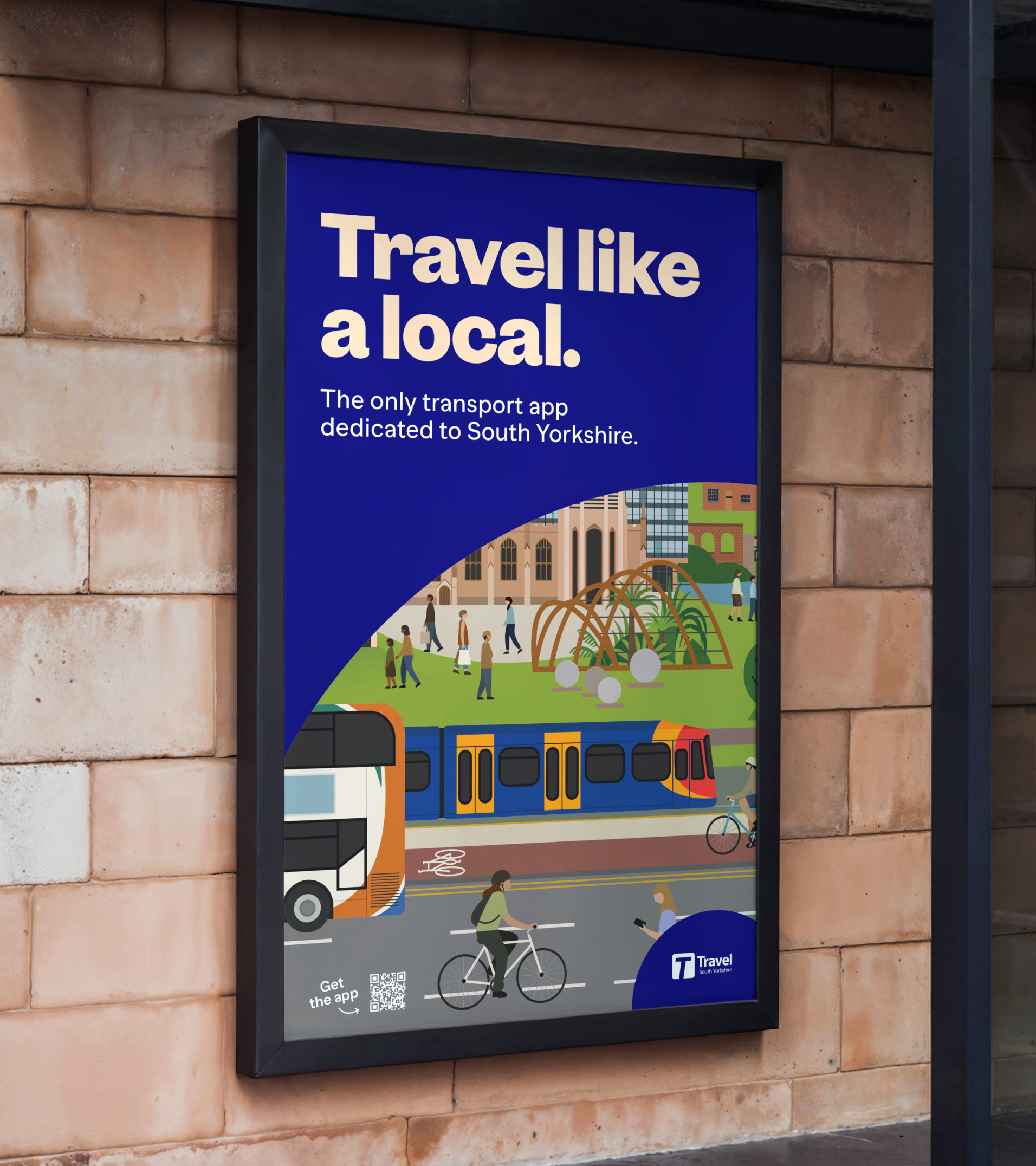
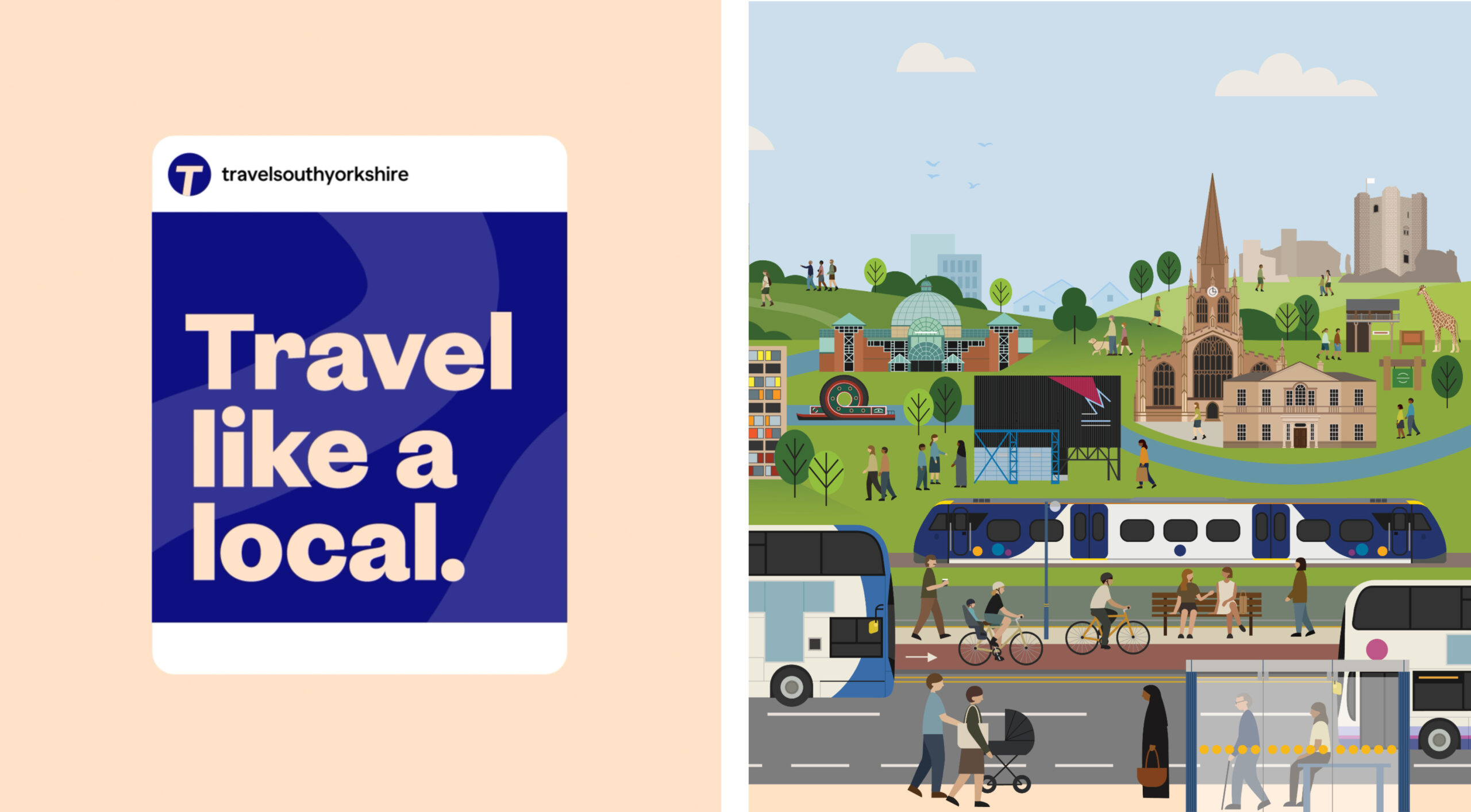
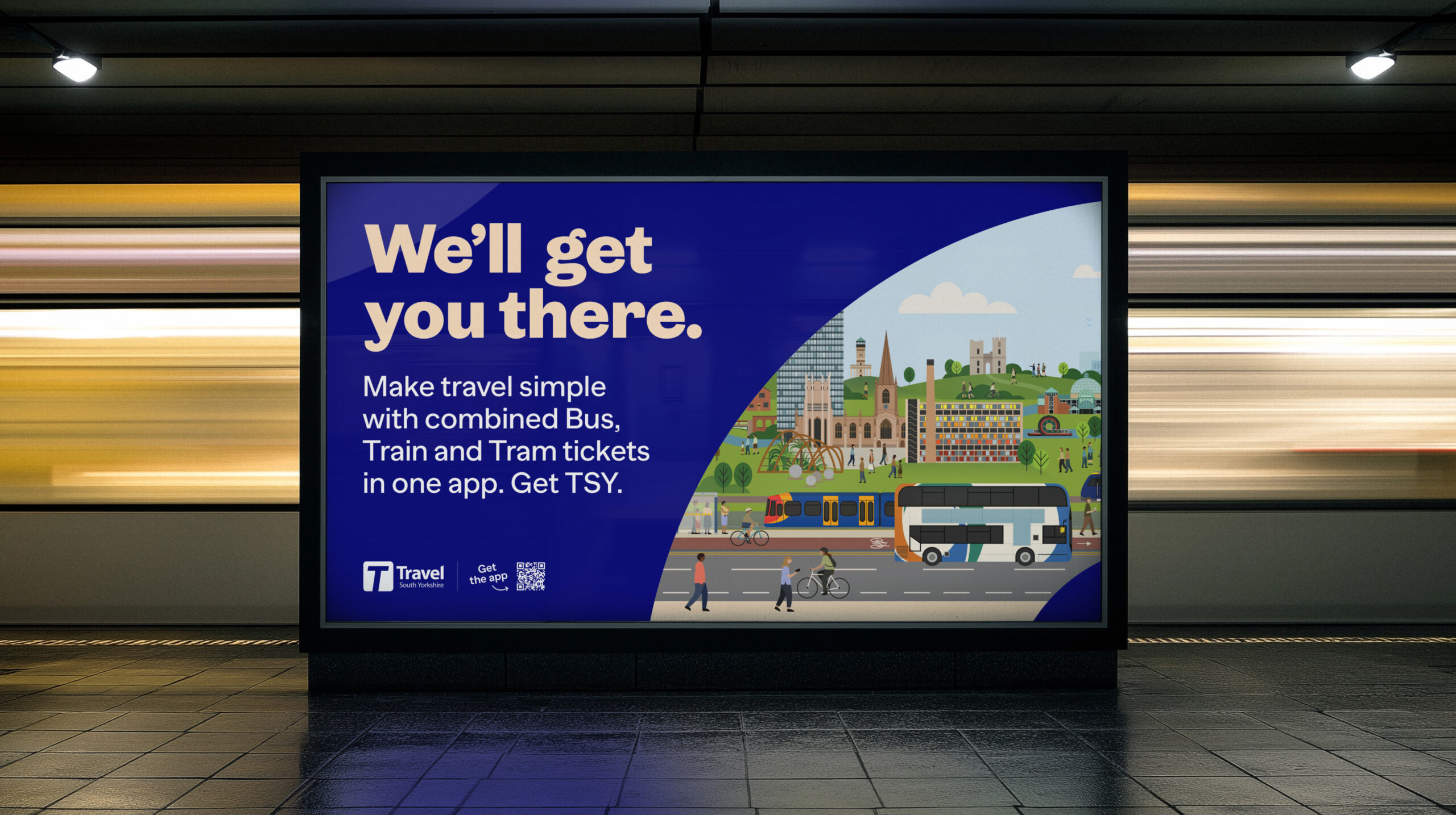
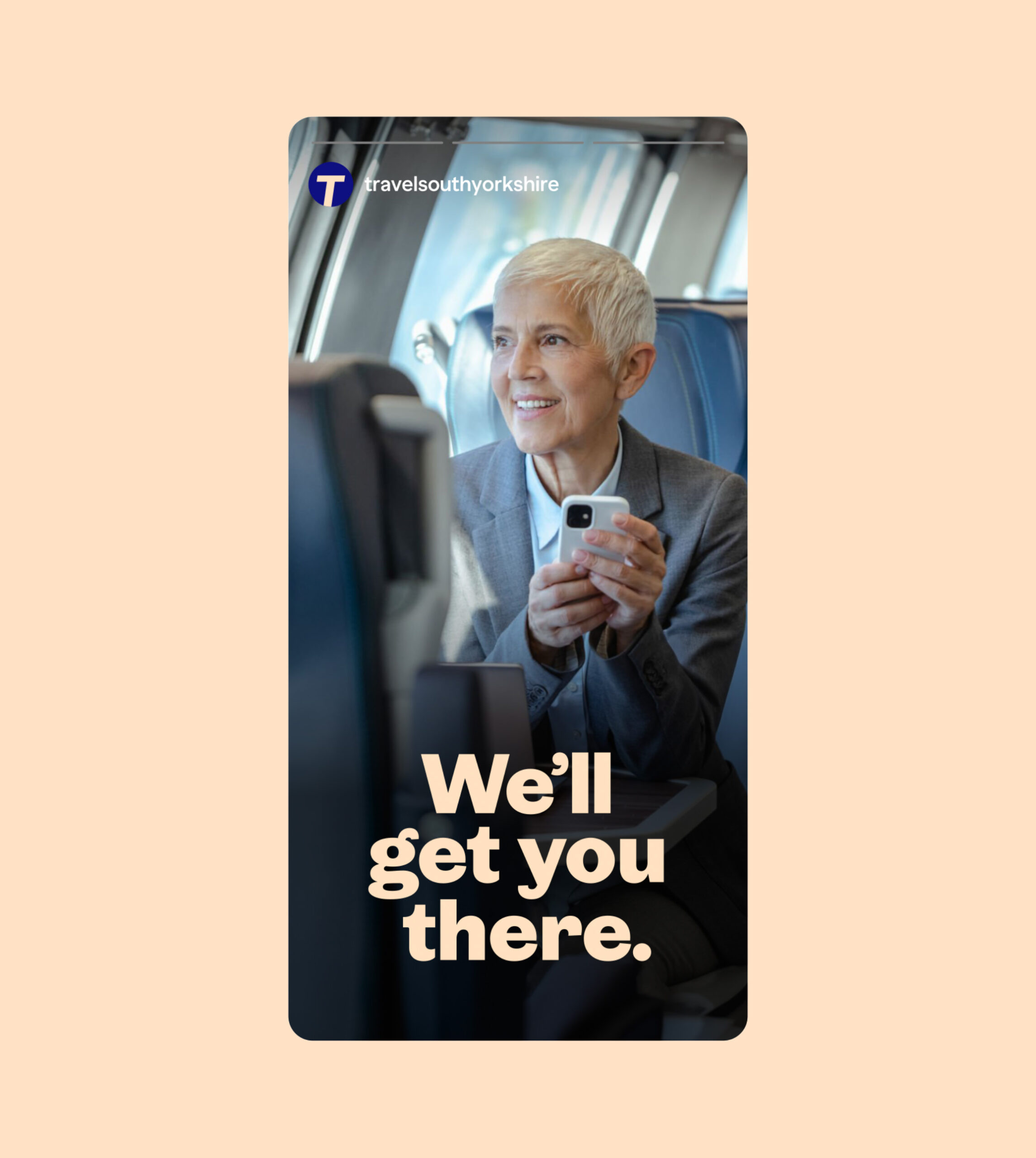
We developed the campaign around the message: We’ll get you there.
It’s a line that works on two levels – speaking both to the practical side of travel and the reasons behind it. Whether someone is commuting to work, heading home or meeting loved ones, the message reinforces TSY as a reliable part of everyday life.
Visually, we created a bold and flexible identity built around movement, warmth and clarity. A flowing route graphic brings energy and direction across layouts, while confident typography and strong colour create impact across print and digital applications.
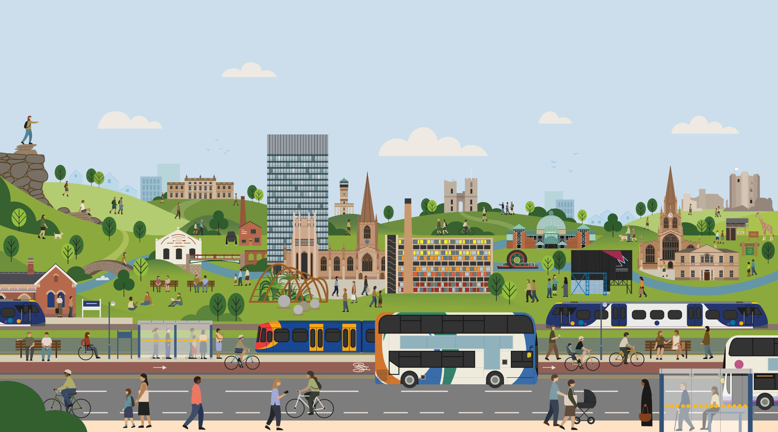
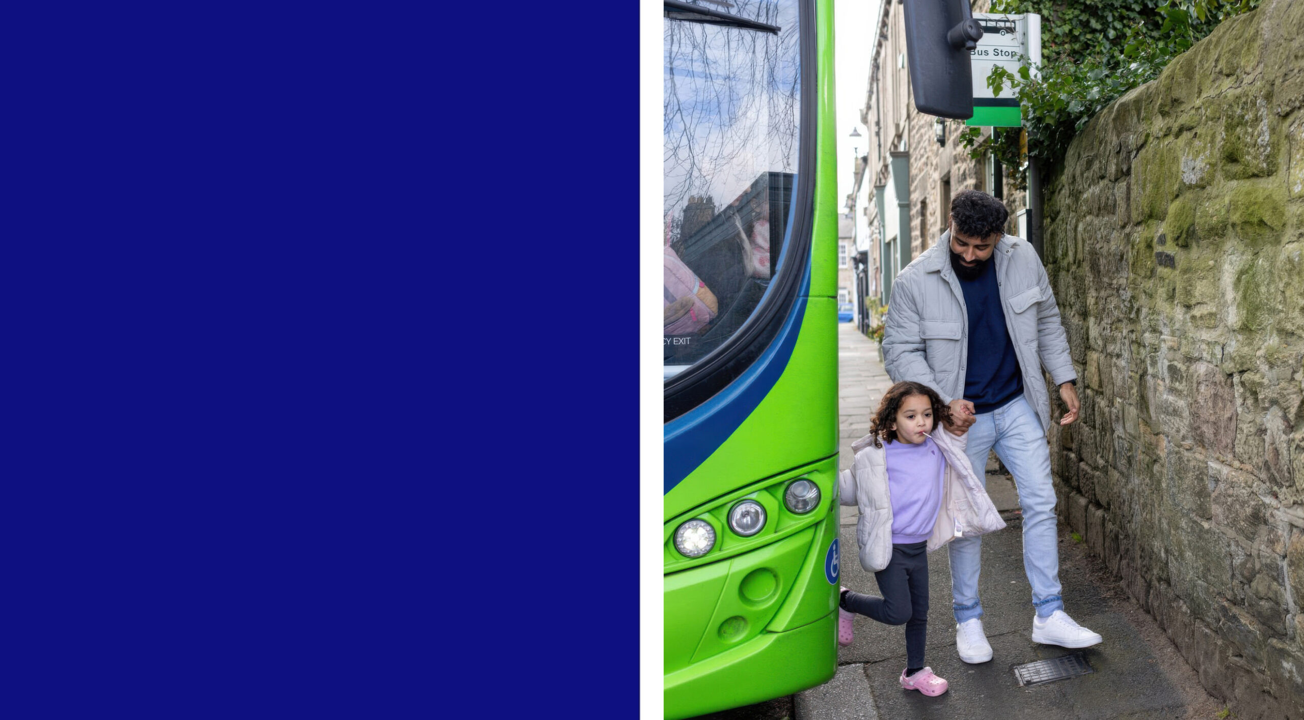
We used honest, human imagery showing people mid-journey – commuters, families and friends – helping the campaign feel relatable and grounded in real life. Illustrations featuring recognisable South Yorkshire landmarks reinforced the app’s local connection and sense of place.
To make the proposition instantly clear, we paired the creative with simple supporting messaging including Travel by Bus, Tram and Train with one app, alongside direct download prompts and QR codes to encourage action.
Across the campaign, the tone remained conversational, warm and straightforward. Playful headlines helped bring personality without losing clarity, creating a brand experience that felt approachable, useful and easy to trust.
We partnered with Travel South Yorkshire to develop a campaign that would help more people discover and choose TSY for everyday travel.
Our role was to evolve the brand experience across digital and print touchpoints, creating a campaign that felt clear, relatable and genuinely useful. The focus wasn’t on overcomplicating travel – it was about showing how TSY makes moving around South Yorkshire simpler, more flexible and more dependable.
At the heart of the campaign was a straightforward idea: travel matters because of where it takes you – home after work, to family, to friends, to important moments. We built a brand message and visual identity to reflect that emotional connection while staying practical, confident and easy to understand.

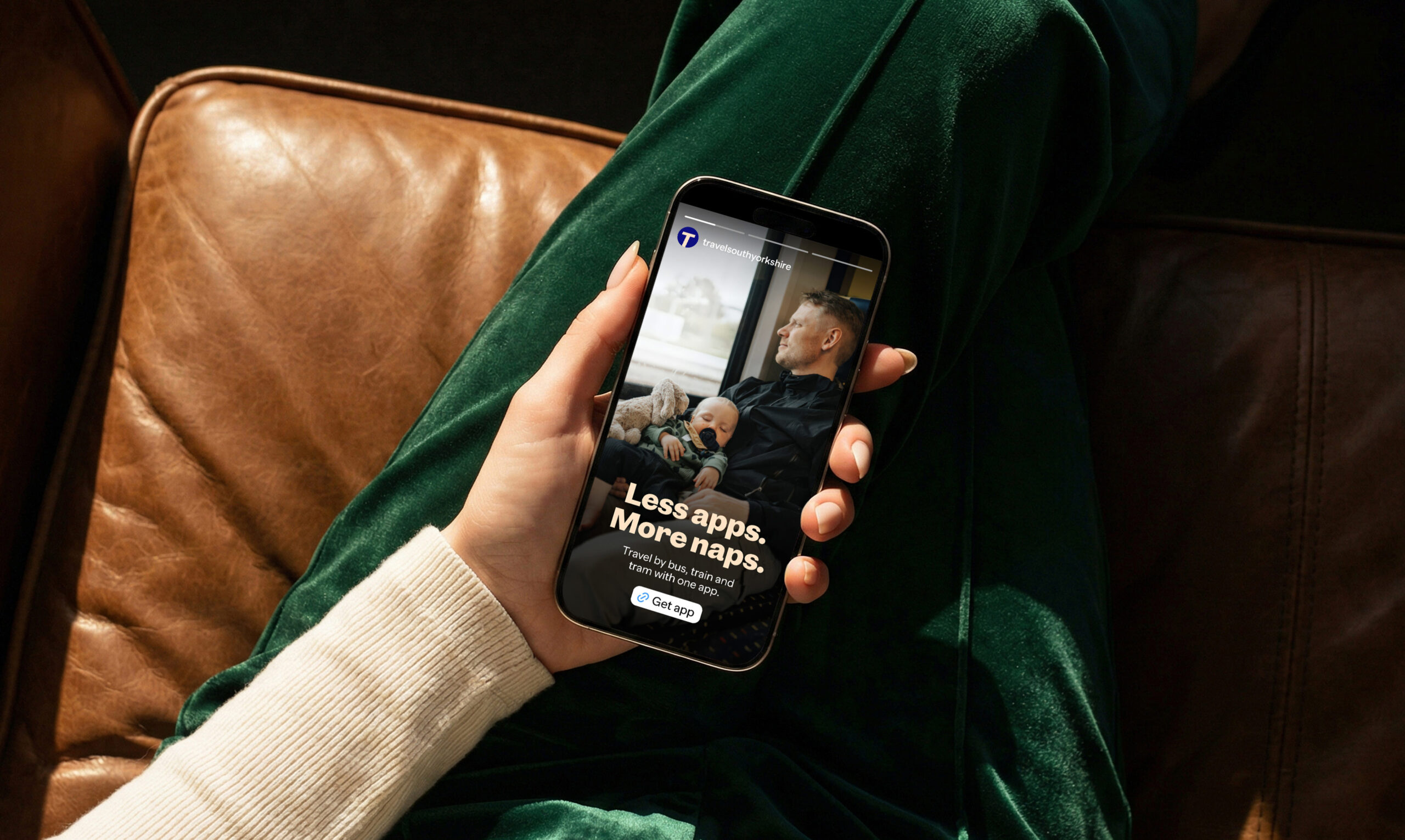
TSY’s biggest strength is its simplicity – one app for bus, tram and train travel. No more juggling multiple apps, tickets, passwords and sign-ups. Less admin = more life.
While many transport apps operate nationally, TSY has a strong regional focus – something we saw as a real strength rather than a limitation. We leaned into that local connection to position TSY as a travel companion built specifically for South Yorkshire. By grounding the campaign in recognisable places, real journeys and everyday experiences, we created something more personal and trustworthy over a generic transport app.
Our insight was simple: people don’t want travel to feel difficult. They want something reliable, intuitive and stress-free. That thinking shaped every part of the campaign – from the messaging and tone of voice to the visual identity and imagery.
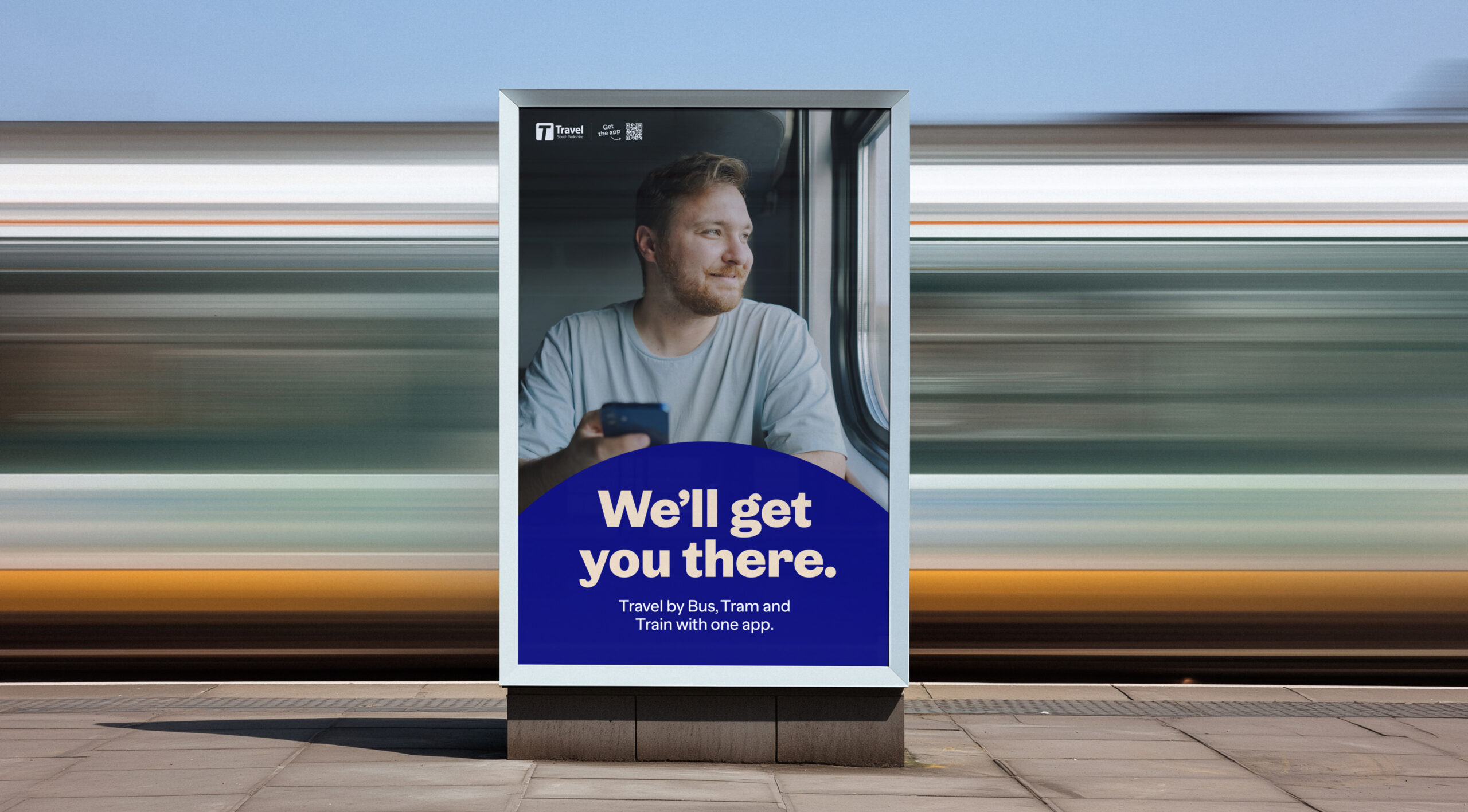
We developed the campaign around the message: We’ll get you there.
It’s a line that works on two levels – speaking both to the practical side of travel and the reasons behind it. Whether someone is commuting to work, heading home or meeting loved ones, the message reinforces TSY as a reliable part of everyday life.
Visually, we created a bold and flexible identity built around movement, warmth and clarity. A flowing route graphic brings energy and direction across layouts, while confident typography and strong colour create impact across print and digital applications.

We used honest, human imagery showing people mid-journey – commuters, families and friends – helping the campaign feel relatable and grounded in real life. Illustrations featuring recognisable South Yorkshire landmarks reinforced the app’s local connection and sense of place.
To make the proposition instantly clear, we paired the creative with simple supporting messaging including Travel by Bus, Tram and Train with one app, alongside direct download prompts and QR codes to encourage action.
Across the campaign, the tone remained conversational, warm and straightforward. Playful headlines helped bring personality without losing clarity, creating a brand experience that felt approachable, useful and easy to trust.
“It was a pleasure working with Foundry on our campaign. They quickly understood the brief and delivered a strong range of creative assets that gave us plenty of flexibility throughout the campaign. Their strategic approach was thoughtful and well developed, helping to shape a strong campaign. The team were responsive, collaborative, and a pleasure to work with”.
Jack Martin, Marketing Manager at South Yorkshire Mayoral Combined Authority