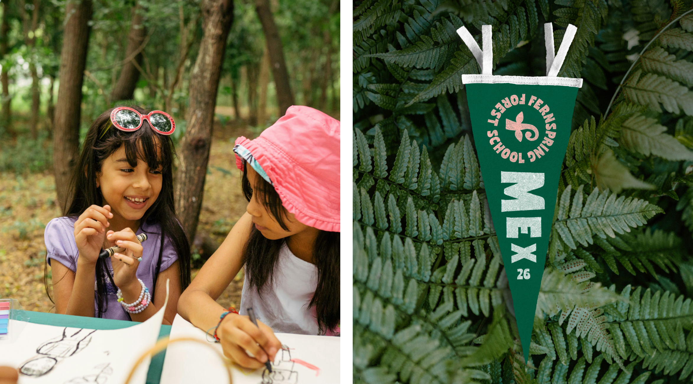
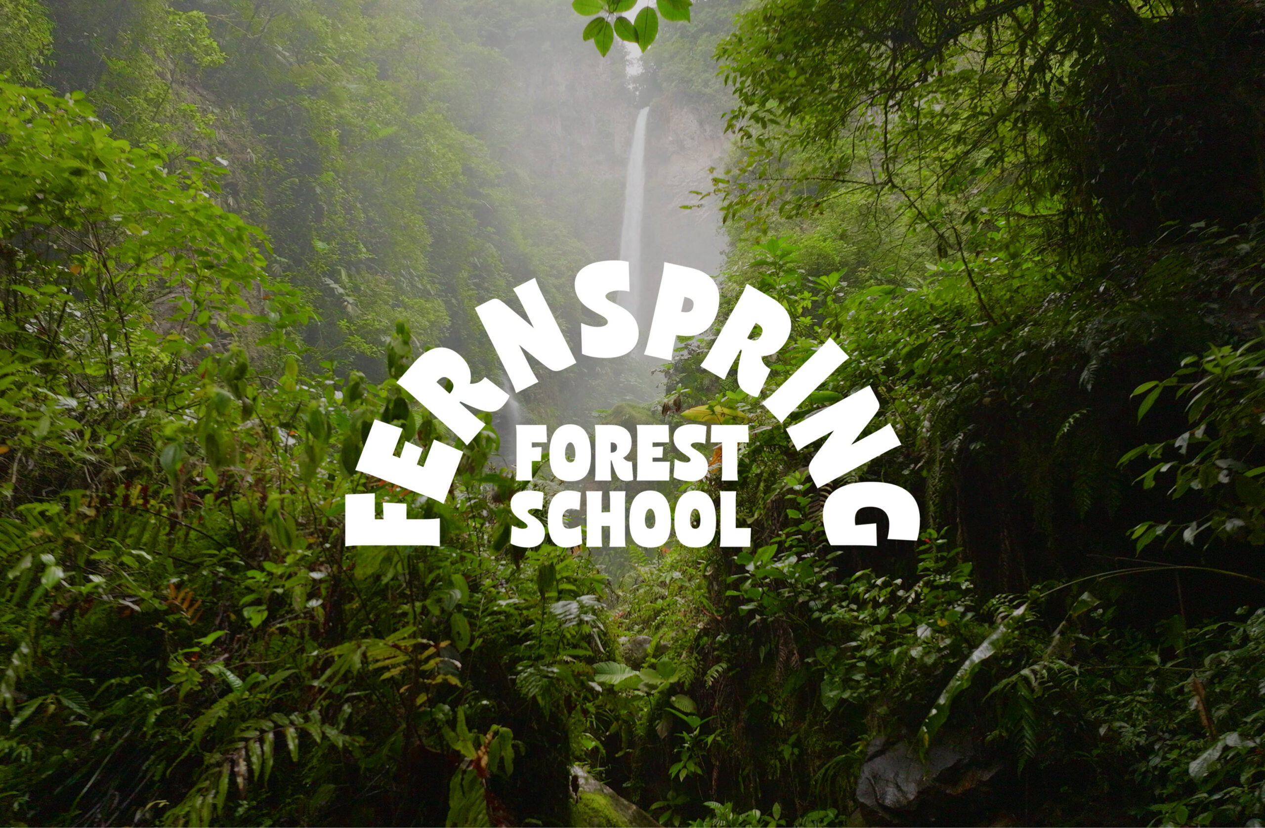
Fernspring Forest School is nestled within the natural landscape of Guadalajara, Mexico, where children learn outdoors through play, exploration and their own curiosity. There’s space to make things, ask questions, get moving and slow down.
The school’s approach starts with respect for children and the belief that they’re capable, curious learners. Its mission is to help them grow at their own pace, with the freedom to discover who they are and build connections with nature and the people around them.
We wanted the brand to capture the freedom and enjoyment of learning at Fernspring, as well as the care behind the school’s approach.
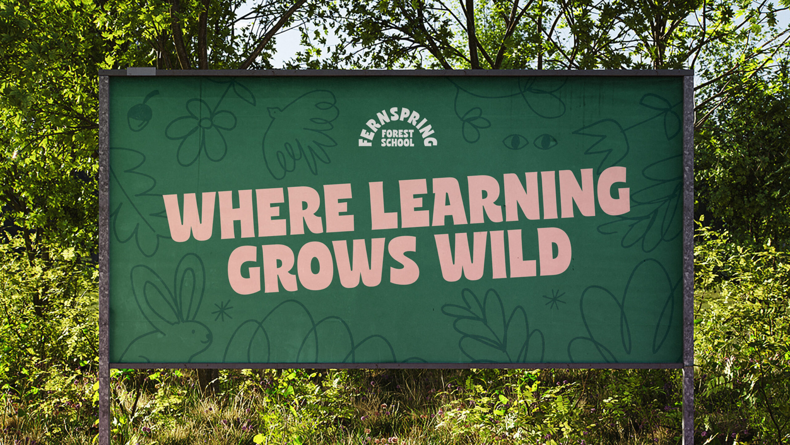
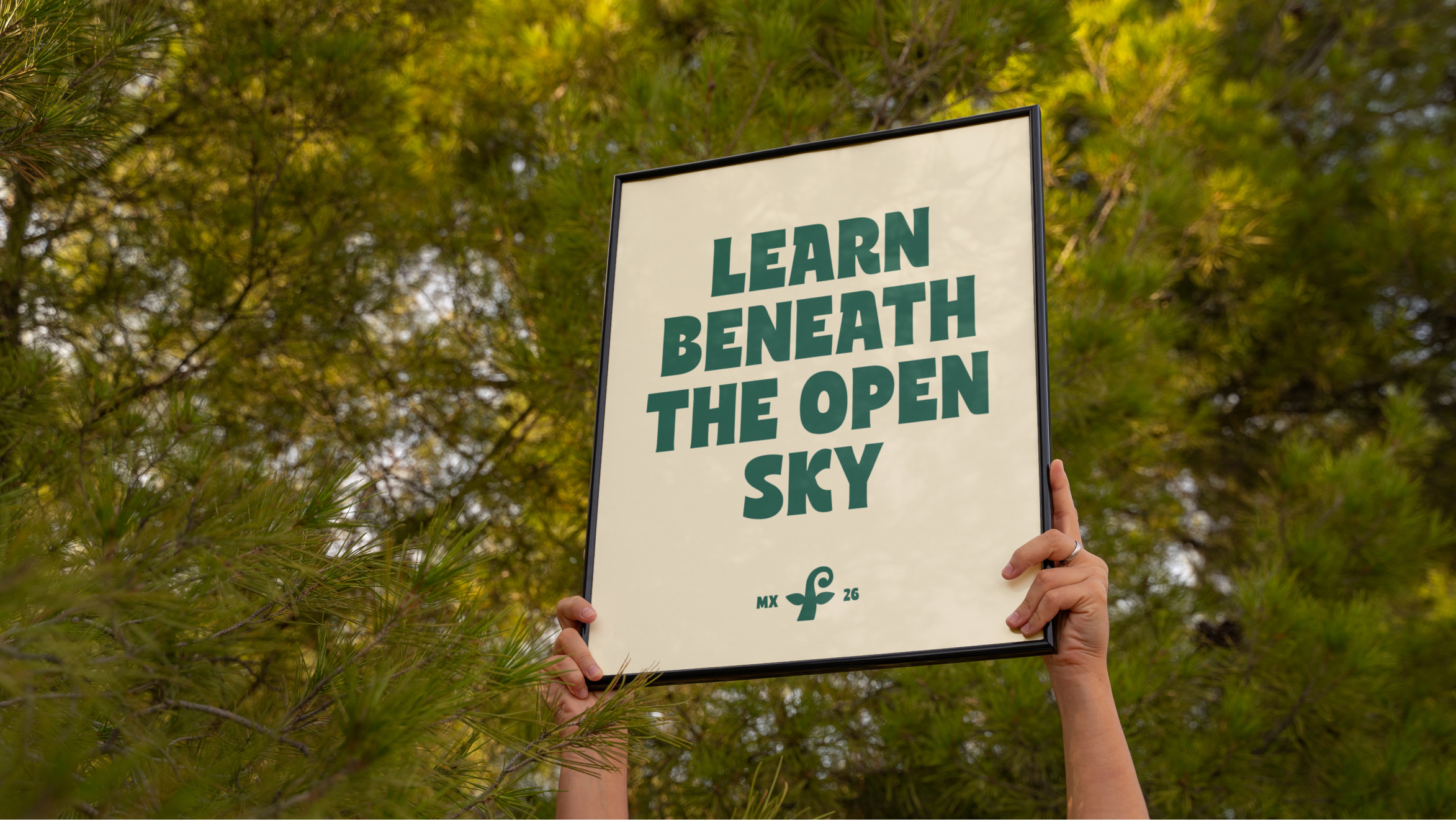
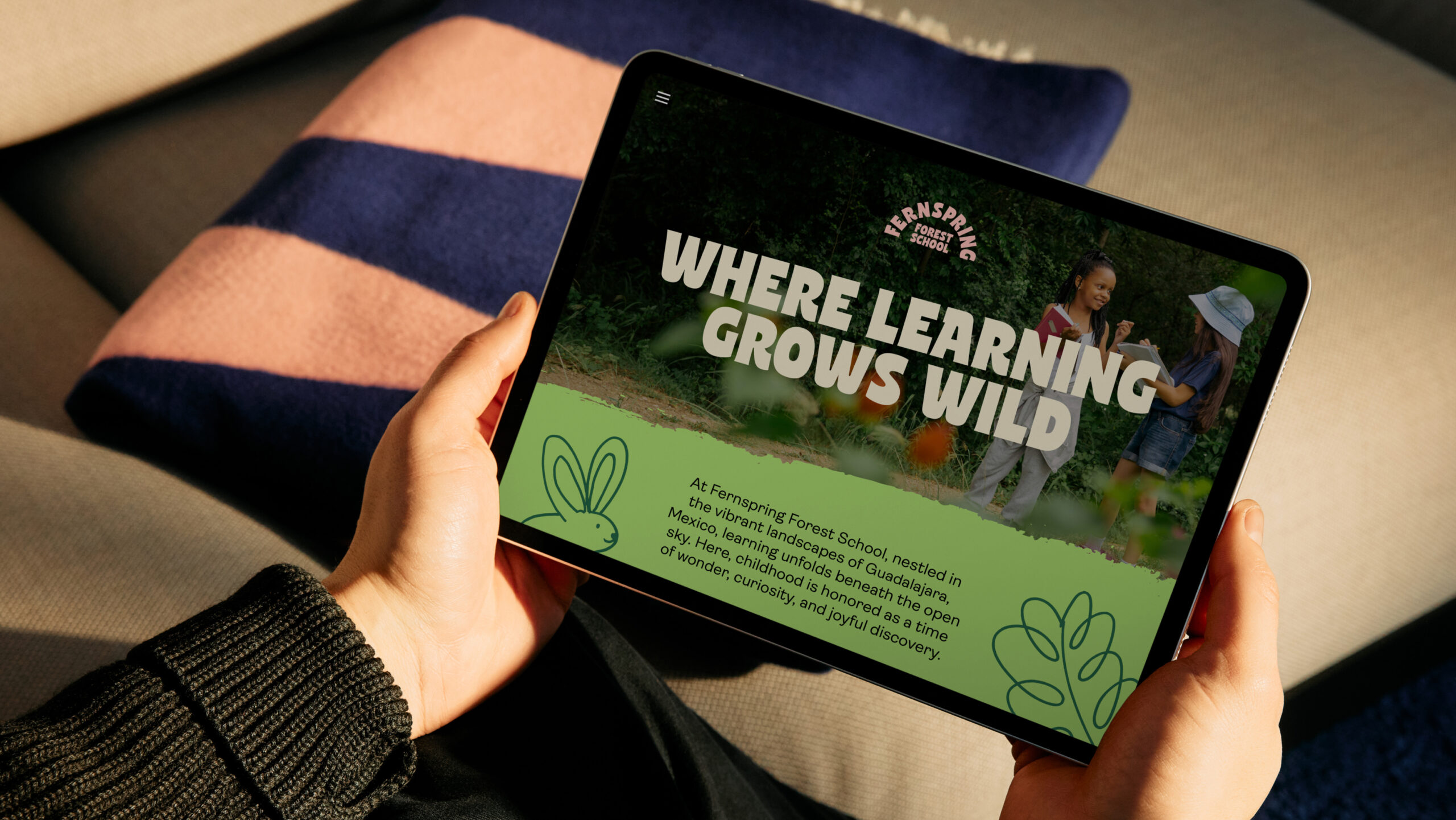
‘Where learning grows wild’ brings those ideas together. It speaks to a school where curiosity has room to lead and the forest plays an active part in how children learn. Watching an animal, building something by hand or asking a question can all become starting points for discovery. This gave us a clear direction: a brand rooted in the forest, with a sense of play and a thoughtful approach that families could connect with.
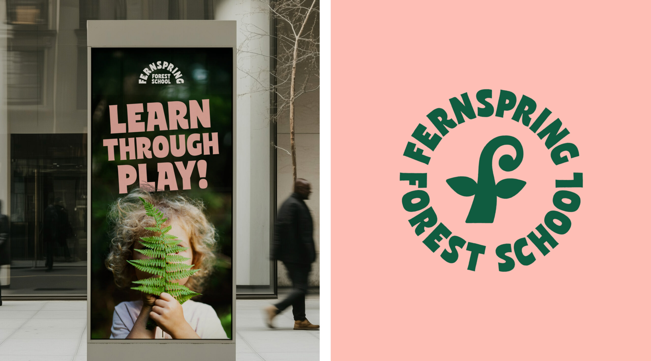
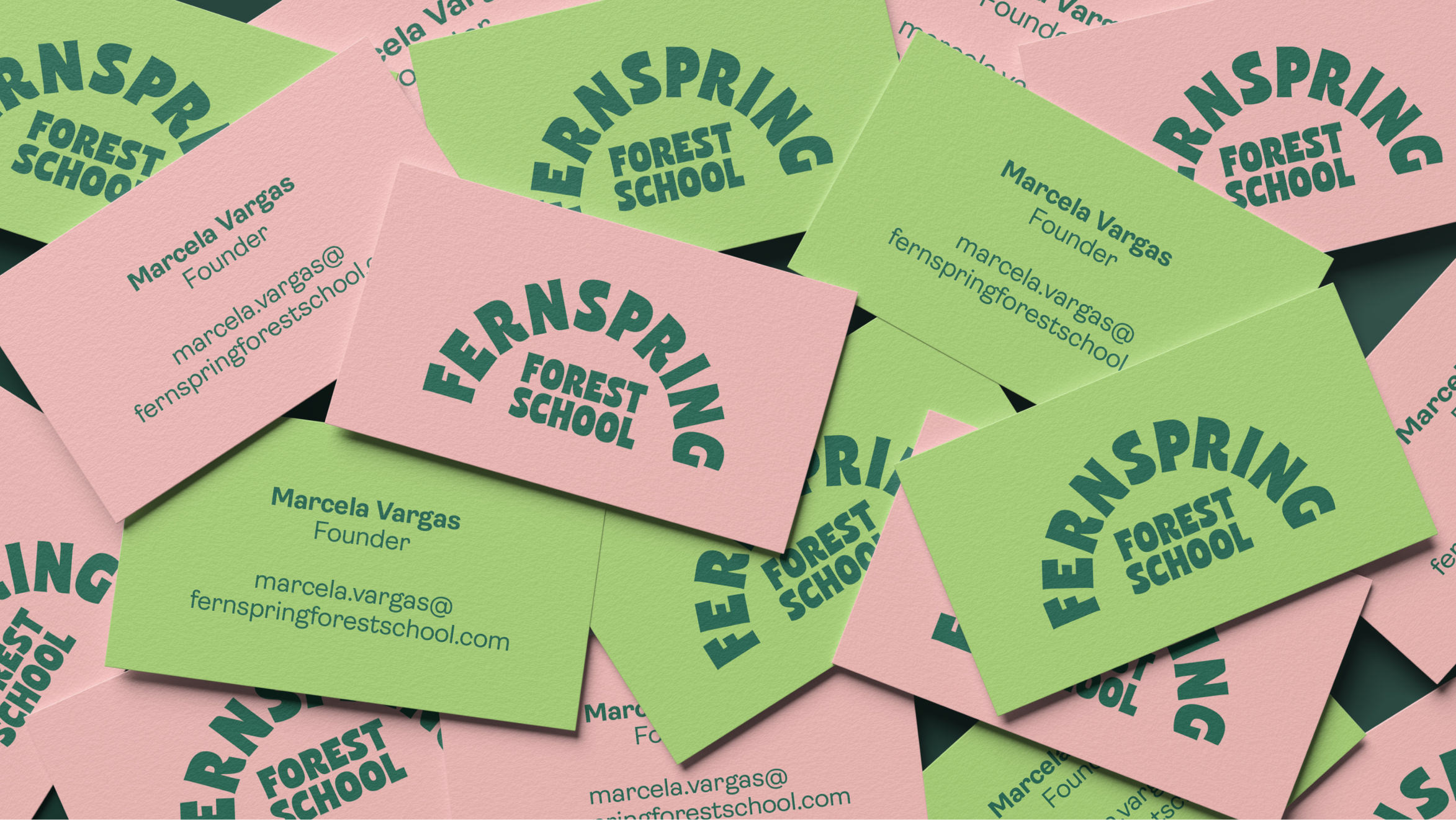
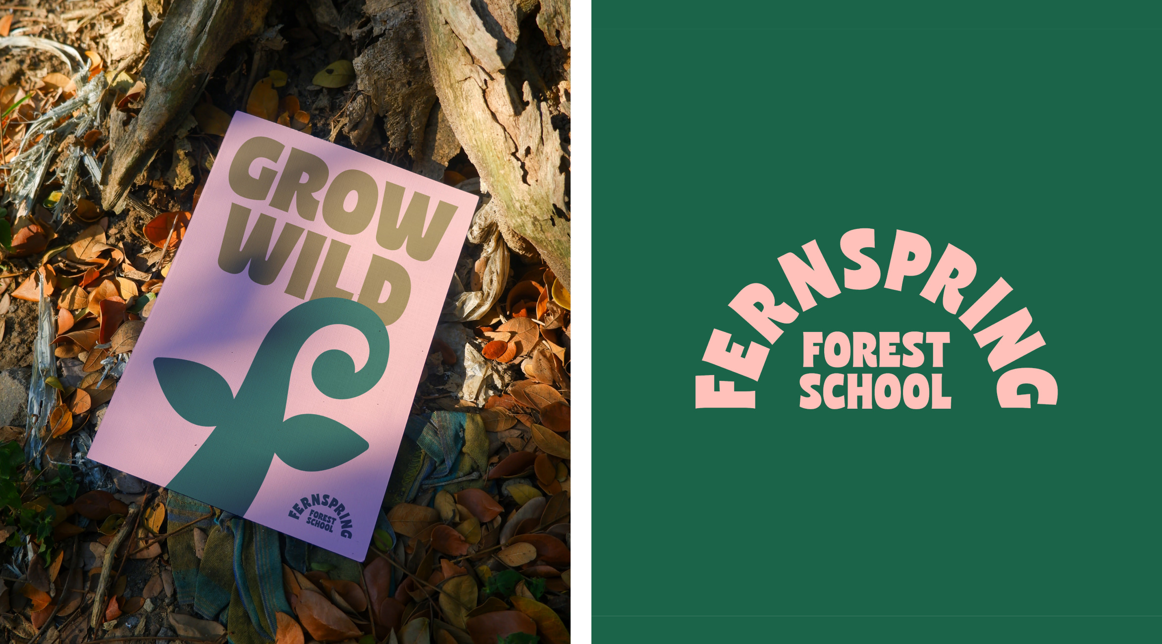
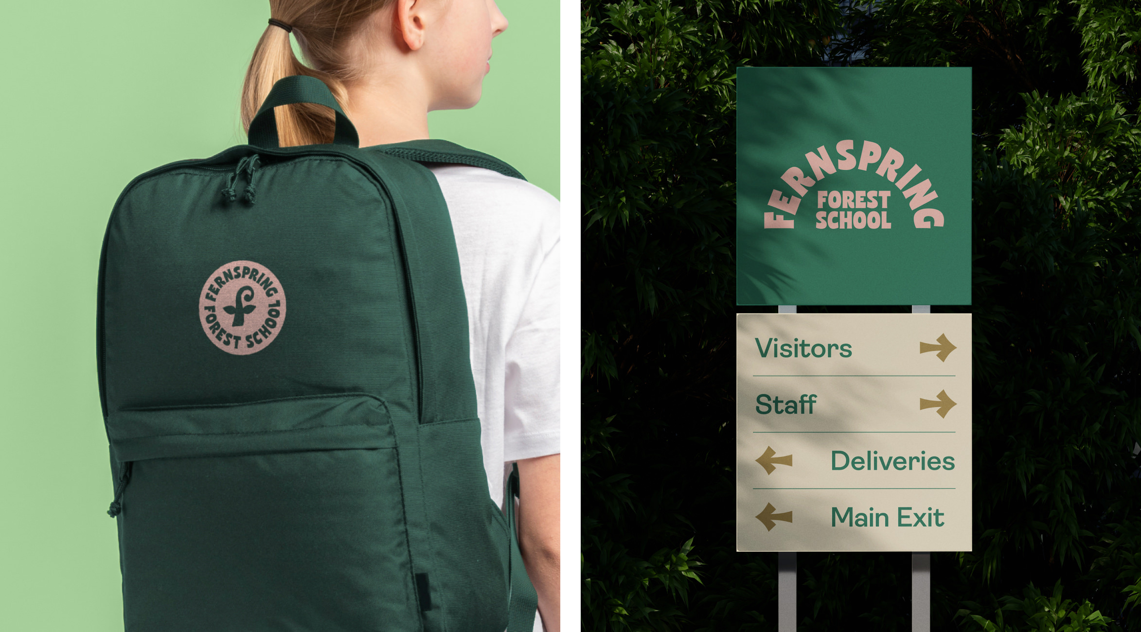
At the heart of the identity is a simple expression of growth. A graphic fern sprout reflects the school’s role in helping children flourish, and its shape subtly forms an ‘f’, linking it back to the Fernspring name.
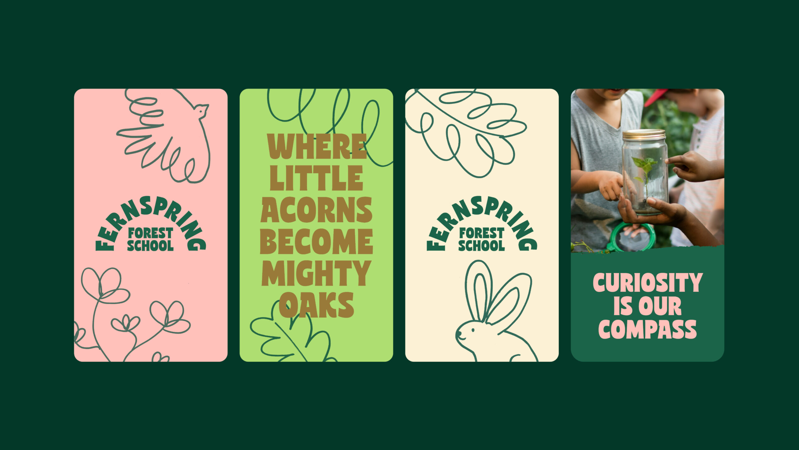
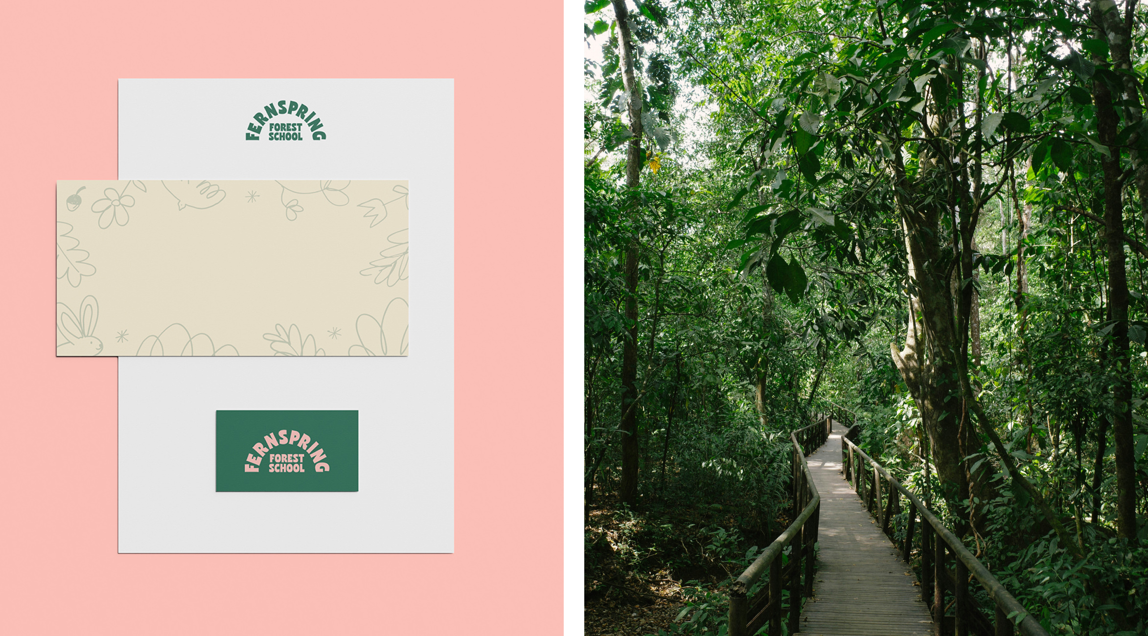
We paired nature-inspired greens with pale pink to give the palette a fresh, slightly unexpected feel. Brown and beige tones add warmth and help balance the more vibrant colours. Together, they make the identity feel lively and welcoming.
Hand-drawn illustrations bring the forest into the wider identity. Their loose lines and imperfect edges add character and echo the creativity of the children themselves. The style feels playful, with enough care in the details to give the brand a sense of confidence.
We wanted these elements to give parents a feel for life at Fernspring: the enjoyment of their children making something, the freedom to follow an interesting question, and the quieter moments spent noticing what’s around them.
Fernspring Forest School is nestled within the natural landscape of Guadalajara, Mexico, where children learn outdoors through play, exploration and their own curiosity. There’s space to make things, ask questions, get moving and slow down.
The school’s approach starts with respect for children and the belief that they’re capable, curious learners. Its mission is to help them grow at their own pace, with the freedom to discover who they are and build connections with nature and the people around them.
We wanted the brand to capture the freedom and enjoyment of learning at Fernspring, as well as the care behind the school’s approach.
‘Where learning grows wild’ brings those ideas together. It speaks to a school where curiosity has room to lead and the forest plays an active part in how children learn. Watching an animal, building something by hand or asking a question can all become starting points for discovery. This gave us a clear direction: a brand rooted in the forest, with a sense of play and a thoughtful approach that families could connect with.
At the heart of the identity is a simple expression of growth. A graphic fern sprout reflects the school’s role in helping children flourish, and its shape subtly forms an ‘f’, linking it back to the Fernspring name.
We paired nature-inspired greens with pale pink to give the palette a fresh, slightly unexpected feel. Brown and beige tones add warmth and help balance the more vibrant colours. Together, they make the identity feel lively and welcoming.
Hand-drawn illustrations bring the forest into the wider identity. Their loose lines and imperfect edges add character and echo the creativity of the children themselves. The style feels playful, with enough care in the details to give the brand a sense of confidence.
We wanted these elements to give parents a feel for life at Fernspring: the enjoyment of their children making something, the freedom to follow an interesting question, and the quieter moments spent noticing what’s around them.